Chapter 1, Motivation
The purpose of this manual is to explain the usage of animint2, an R package for interactive data visualization. This introductory chapter answers the following questions:
- What are data, and how are they analyzed?
- What is data visualization, and when is it useful for data analysis?
- What is interactive data visualization, and when is it useful?
This introductory chapter uses the following outline:
- What is data?
- Small data – data visualization is not necessary.
- Medium data – static data visualization is sufficient.
- Large data – interactive data visualization is useful.
What is data?
Data are any pieces of information that are systematically recorded, either on paper or on a computer. Anybody can create data, just by systematically writing things down. Typically, data are created in order to help answer a specific question, and are organized into tables with rows for observations and columns for variables or different types of information. The word “data” is the plural form of “datum,” which we use to refer to one observation/row of a data table. We use the term “data set” to refer to a subset of observations/rows, or the entire data table.
There are many examples of data that could be created to answer questions based on everyday experiences:
- How does the weather this year compare to previous years? Have we had more or less rain than usual? To answer these questions, we could create a data table with column for measurements of different weather conditions: temperature, rainfall, etc. There should also be columns for the date and time of each observation, and a row for each observation.
- How is this new diet affecting me? If you are trying a new diet, you may want to record what you eat and how you feel after each meal. In that case you could make a table with a row for each meal and four columns: date, time, what you ate, and how you felt after.
- Does this new lung cancer treatment work better than the old treatment? A doctor who conducts the clinical trial would randomly assign patients to receive either the new or old treatment. The doctor would then create a data table with a row for each patient, and several columns: years the patient has smoked, treatment type (new or old), patient age at treatment, patient age at death.
We define “data analysis” as the process of answering these questions by converting the raw data table into other, more comprehensible forms. One highly effective class of methods for data analysis is called “data visualization,” which seeks to provide answers to questions by converting a data set into an informative picture. The term “data visualization” refers to both the picture itself (also known as a plot, chart, figure, graph, graphic, or data viz), and the process of creating the picture.
There are many different ways to perform data analysis, and data sets of different sizes should be analyzed using different techniques. There are many different ways to characterize the size of data sets, and every author uses a slightly different definition. In this manual we will use a classification of data sets into three sizes: small, medium, and large. We begin by discussing small data sets, for which data visualization is not necessary.
Small data analysis without visualization
In this section, we will discuss “small data,” which are small enough such that data analysis can be done by simply looking at the entire data table. For small data sets, there is no need to use data visualization. Instead, the data can simply be presented for visual inspection in a table.
As a concrete example, consider the famous tea tasting experiment proposed by Ronald Fisher. A Lady claimed that she could taste the difference when milk is added to the teacup before or after the tea. Fisher asked the question, can the Lady really taste the difference between the two types of tea?
To answer that question, Fisher prepared four cups of tea with milk added after, and four cups of tea with milk added before. Fisher then placed the cups in a random order, had the Lady taste all eight cups of tea, and asked her to identify the four in which milk was added after the tea. According to help(fisher.test) in R, the Lady correctly identified three of the four cups in which milk was added after the tea. Fisher than wrote down the following data: the total number of cups (8), the total number of cups with milk added (4), and the total number of cups that the Lady correctly identified (3). In R, this data set can be viewed by printing a contingency table of count data:
##       Truth
## Guess  Milk Tea
##   Milk    3   1
##   Tea     1   3
In this case, the data set is small enough such that Fisher’s question can be answered by simply looking at the data table itself. If the Lady had been able to correctly identify all four cups, then that would have been a very convincing demonstration of her ability. However, she was apparently only able to correctly identify three out of the four cups, which is less convincing.
The main topic of this manual is data visualization, which is not necessary for such small data sets. Instead, we will focus on data sets that are too big to be analyzed by manual visual inspection of the data table.
Medium data analysis with static data visualizations
For medium sized data sets, simply inspecting the data table is no longer sufficient to answer the questions posed during data analysis. Medium data are big enough such that we need to use visualization to understand the data.
For example, consider the following data on atmospheric carbon dioxide (CO2) concentrations, recorded monthly between 1959 and 1997.
## [1] "C"## year.int month.int month year.month.POSIXct ppm
## <int> <int> <fctr> <POSc> <num>
## 1: 1959 1 January 1959-01-15 315.42
## 2: 1959 2 February 1959-02-15 316.31
## 3: 1959 3 March 1959-03-15 316.50
## 4: 1959 4 April 1959-04-15 317.56
## 5: 1959 5 May 1959-05-15 318.13
## ---
## 464: 1997 8 August 1997-08-15 362.57
## 465: 1997 9 September 1997-09-15 360.24
## 466: 1997 10 October 1997-10-15 360.83
## 467: 1997 11 November 1997-11-15 362.49
## 468: 1997 12 December 1997-12-15 364.34Printing these data on the R command line shows that there are 468 rows/observations total. This is not a huge number of observations, but it is already big enough so that answering questions is not easy by simple visual inspection of the data table. Instead, we will create a static data visualization:
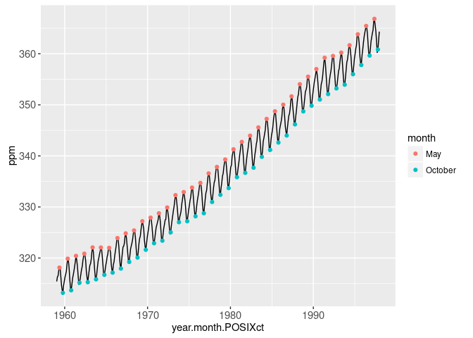
The static data visualization shows that CO2 concentrations increased over the second half of the twentieth century. This particular data visualization is called a Keeling Curve. It is named after Charles David Keeling, the pioneering scientist who collected the first frequent regular data on atmospheric CO2. The general increasing trend can be explained by considering the chemical process of combustion, which converts oxygen to CO2. Keeling noted that “the observed rate of increase is nearly that to be expected from the combustion of fossil fuel” (REF: The Concentration and Isotopic Abundances of Carbon Dioxide in the Atmosphere, Keeling 1960).
The data visualization also reveals the interesting seasonal trend that attains a local maximum each May and a local minimum each October. This seasonal trend can be explained by considering the forests in the Northern Hemisphere. The leaves on the trees in these forests perform photosynthesis, the chemical conversion of CO2 to oxygen. During the winter months there are no leaves on the trees, so CO2 accumulates in the atmosphere until it peaks in May of each year. When the leaves come back each year, they perform photosynthesis throughout Spring and Summer, which causes the atmospheric CO2 concentration to drop until it reaches its yearly minimum in October.
We say that this data visualization is “static” or “non-interactive” because the reader can view it but can not change what is displayed. That is fine for medium sized data sets, in which we can see all the details of the data set. However, as we discuss in the following section, static data visualization is not sufficient to show all the details in larger data sets.
Large data analysis with interactive data visualization
Some data sets are so large that it is not possible or desirable to plot all of the data at once in a static data visualization. For such “large data” sets, traditional approaches to data analysis include summarizing the data, and then visualizing the summary. However, the summary can be misleading, because it does not show all the details of the original data. In such situations, “interactive data visualization” becomes useful.
First, let us consider a slightly more complicated form of the Keeling Curve data visualization.
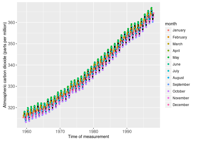
The plot above shows colored points for each month of the year, rather than for only May and September, the yearly local minima that we wanted to emphasize. Since it lacks this emphasis, this static plot is not as informative as the previous plot. This is an example where it is not desirable to plot all of the data at once. We can solve this problem using the following interactive plot.
In the plot above, the default emphasis is May and October, but the user can click the legend to update the emphasis. This simple example illustrates the main idea of interactive data visualization using animint. There are many choices that must be made to show details of big data sets. For example, the choice of which months to emphasize in the plot above. Rather than fixing such choices in a static plot, the goal of interactive data visualization is to allow the reader to see what the plot looks like when different choices are made. In the example above, we used an interactive legend which allows the user to select different months and see what the plot looks like after changing the selection.
The example above also provides a good example of clickSelects and showSelected, the two keywords that animint introduces to allow interaction. Without going into too many details, the plot above uses clickSelects=month for the interactive legend, meaning that clicking the legend should change the selected months. Furthermore, we used showSelected=month for the points, meaning that we should only plot the set of points which corresponds to the currently selected months. In Chapters 3-4, we will explain how to design data visualizations by writing R code using these two new keywords.
Chapter summary and exercises
This chapter explained some basic facts about data, and gave definitions of different sizes of data: small, medium, and large.
- Based on the definitions introduced in this chapter, what is the difference between small and medium data?
- What is the difference between medium and large data?
Next, Chapter 2 explains how the grammar of graphics can be used to create data visualizations.
