Chapter 8, World Bank data viz
In this chapter we will explore several data visualizations of the World Bank data set.
Chapter outline:
- We begin by loading the World Bank data set and defining some helper functions for creating a multi-panel ggplot with several geoms.
- We then create a time series plot for life expectancy.
- We then add a scatterplot of life expectancy versus fertility rate as a second panel.
- We then add a third panel with a time series for fertility rate.
Load data and define helper functions
First we load the WorldBank data set, and consider only the subset which has both non-missing values for both life.expectancy and fertility.rate.
library(animint2)
data(WorldBank)
WorldBank$Region <- sub(" (all income levels)", "", WorldBank$region, fixed=TRUE)
library(data.table)
not.na <- data.table(
  WorldBank)[!(is.na(life.expectancy) | is.na(fertility.rate))]
We will also be plotting the population variable using a size legend. Before plotting, we will make sure that none of the values are missing.
not.na[is.na(not.na$population)]## iso2c country year fertility.rate life.expectancy population
## <char> <char> <num> <num> <num> <num>
## 1: KW Kuwait 1992 2.338 72.95266 NA
## 2: KW Kuwait 1993 2.341 73.07373 NA
## 3: KW Kuwait 1994 2.413 73.18724 NA
## GDP.per.capita.Current.USD 15.to.25.yr.female.literacy iso3c
## <num> <num> <fctr>
## 1: NA NA KWT
## 2: NA NA KWT
## 3: NA NA KWT
## region capital longitude
## <fctr> <fctr> <fctr>
## 1: Middle East & North Africa (all income levels) Kuwait City 47.9824
## 2: Middle East & North Africa (all income levels) Kuwait City 47.9824
## 3: Middle East & North Africa (all income levels) Kuwait City 47.9824
## latitude income lending Region
## <fctr> <fctr> <fctr> <char>
## 1: 29.3721 High income: nonOECD Not classified Middle East & North Africa
## 2: 29.3721 High income: nonOECD Not classified Middle East & North Africa
## 3: 29.3721 High income: nonOECD Not classified Middle East & North AfricaThe table above shows that there are three rows with missing values for the population variable. They are for the country Kuwait during 1992-1994. The table below shows the data from the neighboring years, 1991-1995.
not.na[country == "Kuwait" & 1991 <= year & year <= 1995]## iso2c country year fertility.rate life.expectancy population
## <char> <char> <num> <num> <num> <num>
## 1: KW Kuwait 1991 2.418 72.82254 1999651
## 2: KW Kuwait 1992 2.338 72.95266 NA
## 3: KW Kuwait 1993 2.341 73.07373 NA
## 4: KW Kuwait 1994 2.413 73.18724 NA
## 5: KW Kuwait 1995 2.525 73.29422 1586123
## GDP.per.capita.Current.USD 15.to.25.yr.female.literacy iso3c
## <num> <num> <fctr>
## 1: 5505.939 NA KWT
## 2: NA NA KWT
## 3: NA NA KWT
## 4: NA NA KWT
## 5: 17143.492 90.18481 KWT
## region capital longitude
## <fctr> <fctr> <fctr>
## 1: Middle East & North Africa (all income levels) Kuwait City 47.9824
## 2: Middle East & North Africa (all income levels) Kuwait City 47.9824
## 3: Middle East & North Africa (all income levels) Kuwait City 47.9824
## 4: Middle East & North Africa (all income levels) Kuwait City 47.9824
## 5: Middle East & North Africa (all income levels) Kuwait City 47.9824
## latitude income lending Region
## <fctr> <fctr> <fctr> <char>
## 1: 29.3721 High income: nonOECD Not classified Middle East & North Africa
## 2: 29.3721 High income: nonOECD Not classified Middle East & North Africa
## 3: 29.3721 High income: nonOECD Not classified Middle East & North Africa
## 4: 29.3721 High income: nonOECD Not classified Middle East & North Africa
## 5: 29.3721 High income: nonOECD Not classified Middle East & North AfricaThe table above shows that the population of Kuwait decreased over the period 1991-1995, consistent with the Gulf War of that time period. We fill in those missing values below.
not.na[is.na(population), population := 1700000]
not.na[country == "Kuwait" & 1991 <= year & year <= 1995]
## iso2c country year fertility.rate life.expectancy population
## <char> <char> <num> <num> <num> <num>
## 1: KW Kuwait 1991 2.418 72.82254 1999651
## 2: KW Kuwait 1992 2.338 72.95266 1700000
## 3: KW Kuwait 1993 2.341 73.07373 1700000
## 4: KW Kuwait 1994 2.413 73.18724 1700000
## 5: KW Kuwait 1995 2.525 73.29422 1586123
## GDP.per.capita.Current.USD 15.to.25.yr.female.literacy iso3c
## <num> <num> <fctr>
## 1: 5505.939 NA KWT
## 2: NA NA KWT
## 3: NA NA KWT
## 4: NA NA KWT
## 5: 17143.492 90.18481 KWT
## region capital longitude
## <fctr> <fctr> <fctr>
## 1: Middle East & North Africa (all income levels) Kuwait City 47.9824
## 2: Middle East & North Africa (all income levels) Kuwait City 47.9824
## 3: Middle East & North Africa (all income levels) Kuwait City 47.9824
## 4: Middle East & North Africa (all income levels) Kuwait City 47.9824
## 5: Middle East & North Africa (all income levels) Kuwait City 47.9824
## latitude income lending Region
## <fctr> <fctr> <fctr> <char>
## 1: 29.3721 High income: nonOECD Not classified Middle East & North Africa
## 2: 29.3721 High income: nonOECD Not classified Middle East & North Africa
## 3: 29.3721 High income: nonOECD Not classified Middle East & North Africa
## 4: 29.3721 High income: nonOECD Not classified Middle East & North Africa
## 5: 29.3721 High income: nonOECD Not classified Middle East & North AfricaNext, we define the following helper function, which will be used to add columns to data sets in order to assign geoms to facets.
FACETS <- function(df, top, side){
  data.frame(df,
             top=factor(top, c("Fertility rate", "Years")),
             side=factor(side, c("Years", "Life expectancy")))
}
Note that the factor levels will specify the order of the facets in the ggplot. This is an example of the addColumn then facet idiom. Below, we define three helper functions, one for each facet.
TS.RIGHT <- function(df)FACETS(df, "Years", "Life expectancy")
SCATTER <- function(df)FACETS(df, "Fertility rate", "Life expectancy")
TS.ABOVE <- function(df)FACETS(df, "Fertility rate", "Years")
First time series plot
First we define a data set with one row for each year, which we will use for selecting years using a geom_tallrect in the background.
years <- unique(not.na[, .(year)])We define the ggplot with a geom_tallrect in the background, and a geom_line for the time series.
ts.right <- ggplot()+
  geom_tallrect(aes(
    xmin=year-1/2, xmax=year+1/2),
    clickSelects="year",
    data=TS.RIGHT(years), alpha=1/2)+
  geom_line(aes(
    year, life.expectancy, group=country, colour=Region),
    clickSelects="country",
    data=TS.RIGHT(not.na), size=4, alpha=3/5)
ts.right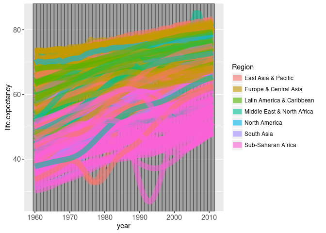
Note that we specified clickSelects=year so that clicking a tallrect will change the selected year, and clickSelects=country so that clicking a line will select or de-select a country. Also note that we used TS.RIGHT to specify columns that we will use in the facet specification (next section).
Add a scatterplot facet
We begin by simply adding facets to the previous time series plot.
ts.facet <- ts.right+
  theme_bw()+
  theme(panel.margin=grid::unit(0, "lines"))+
  facet_grid(side ~ top, scales="free")+
  xlab("")+
  ylab("")
ts.facet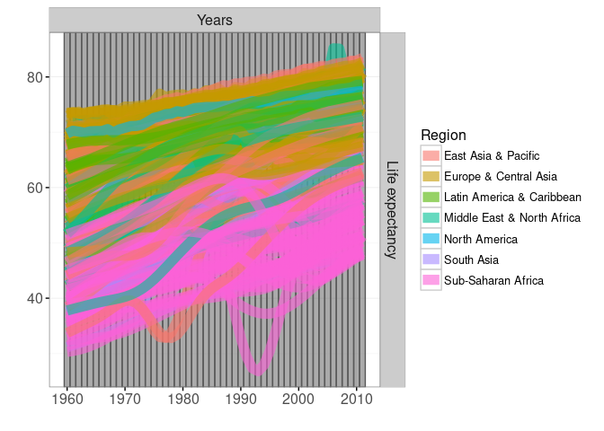
We set the panel.margin to 0, which is always a good idea to save space in a ggplot with facets. We use scales="free" and hide the axis labels, in an example of the addColumn then facet idiom. Instead, we use the facet label to show the variable encoded on each axis. Below, we add a scatterplot facet with a point for each year and country.
ts.scatter <- ts.facet+
  theme_animint(width=600)+
  geom_point(aes(
    fertility.rate, life.expectancy,
    colour=Region, size=population,
    key=country), # key aesthetic for animated transitions!
    clickSelects="country",
    showSelected="year",
    data=SCATTER(not.na))+
  scale_size_animint(pixel.range=c(2, 20), breaks=10^(9:5))
ts.scatter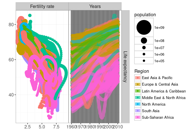
Note how we use scale_size_animint to specify the range of sizes in pixels, and the breaks in the legend. Also note that we use SCATTER to specify top and side columns which are used in the facet specification. We also render this ggplot interactively below.
animint(ts.scatter)
Note that single selection is used by default for both year and country.
Adding another time series facet
Below we add widerects for selecting years, and paths for showing fertility rate.
scatter.both <- ts.scatter+
  geom_widerect(aes(
    ymin=year-1/2, ymax=year+1/2),
    clickSelects="year",
    data=TS.ABOVE(years), alpha=1/2)+
  geom_path(aes(
    fertility.rate, year, group=country, colour=Region),
    clickSelects="country",
    data=TS.ABOVE(not.na), size=4, alpha=3/5)
scatter.both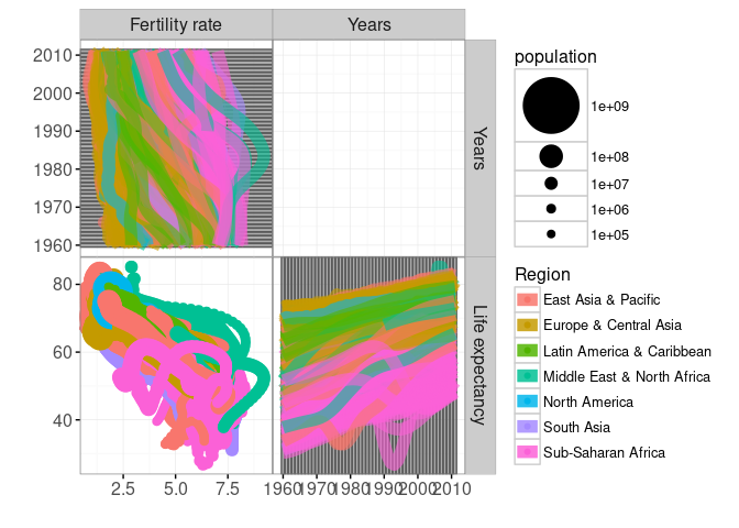
Note that TS.ABOVE was used to specify facet columns top and side. We render an interactive version below.
viz.scatter.both <- animint(
  title="World Bank data (multiple selection, facets)",
  scatterBoth=scatter.both+
    theme_animint(width=1000, height=800),
  duration=list(year=1000),
  time=list(variable="year", ms=3000),
  first=list(year=1975, country=c("United States", "Vietnam")),
  selector.types=list(country="multiple"))
Chapter summary and exercises
We showed how to create a multi-layer, multi-panel (but single-plot) visualization of the World Bank data.
Exercises:
- Add a points on each time series plot, with size proportional to population as in the scatterplot. The points should appear only when the country is selected, and clicking the points should de-select that country.
- Add text labels to the time series plot on the right, with names for each country. Each label should appear only when the country is selected, and should disappear after clicking on the label.
- Add a text label to the scatterplot to indicate the selected year.
- Add text labels to the scatterplot, with names for each country. Each label should appear only when the country is selected, and should disappear after clicking on the label.
Next, Chapter 9 explains how to visualize the Montreal bike data set.
