Appendix, useful idioms
This appendix describes several idioms which are useful for creating animints.
Space saving facets
To emphasize the plotted data in facetted ggplots, eliminate the space between facets using the following idiom.
ggplot()+
  geom_point(aes(Petal.Width, Sepal.Width), iris)+
  theme_bw()+
  theme(panel.margin=grid::unit(0, "lines"))+
  facet_grid(. ~ Species)
There are three parts of this idiom:
panel.margin=0eliminates space between panels.theme_bwactivates a black and white theme (black panel borders and white panel backgrounds). This is necessary in order to see the boundaries between panels, since the ggplot defaulttheme_greyuses grey panel backgrounds and no panel borders.facet_*creates a multi-panel ggplot.
Note that we use the grid unit lines, which equals the height of one line of text at the default size. This is the only grid unit which animint knows how to translate. It is not recommended to use other units such as cm.
List of data tables
The list of data tables idiom is very useful for creating interactive data visualizations of arbitrary complexity. The general form looks like
library(data.table)
outer.data.list <- list()
inner.data.list <- list()
for(outer in outer.vec){
  outer.dt <- computeOuter(outer)
  outer.data.list[[paste(outer)]] <- data.table(outer, outer.dt)
  for(inner in inner.vec){
    inner.dt <- computeInner(outer.dt, inner)
    inner.data.list[[paste(outer, inner)]] <-
      data.table(outer, inner, inner.dt)
  }
}
outer.data <- do.call(rbind, outer.data.list)
inner.data <- do.call(rbind, inner.data.list)
Some comments:
- The first part of the idiom involves initializing empty lists. Here there are two,
outer.data.listandinner.data.list. However there can be as many as necessary. - The second part of the idiom is a bunch of nested for loops that assign data tables to elements of those lists.
- Functions like
computeOuterandcomputeInnercan be used, or you can just do the computations directly inside the for loop. - To ensure that your code will run as fast as possible, use matrix-vector or vector-scalar operations in the innermost for loop. If you only do scalar-scalar operations in your innermost for loop, then you can definitely improve the performance of your code by removing that for loop and re-writing the computation in terms of vector-scalar operations.
- The
pastefunction is used to assign adata.tableto a named list element. Although in principle one could use eitherdata.frameordata.table, in practicedata.tableis often much faster during the last combination step. - The last part of the idiom uses
do.callwithrbindto combine the data tables stored during the for loops.
addColumn then facet
This idiom is useful for creating multi-panel ggplots with aligned axes. First, define a function which takes as input a data table and one or more values which will be used to add factors to that data table.
addColumn <- function(df, time.period){
  data.frame(df, time.period=factor(time.period, c("1975", "1960-2010")))
}
animint(
  ggplot()+
  geom_point(aes(
    x=life.expectancy, y=fertility.rate, color=region),
    data=addColumn(WorldBank1975, "1975"))+
  geom_path(aes(
    x=life.expectancy, y=fertility.rate, color=region,
    group=country),
    data=addColumn(WorldBankBefore1975, "1975"))+
  geom_line(aes(
    x=year, y=fertility.rate, color=region, group=country),
    data=addColumn(WorldBank, "1960-2010"))+
  facet_grid(. ~ time.period, scales="free")+
  xlab(""))
Note that scales="free" and xlab("") are used since the x axes now have very different units (year and life expectancy).
Manual color legends
Color and fill legends in ggplot2 can be manually specified via scale_color_manual and scale_fill_manual. Typically we will choose one of the ColorBrewer palettes:
RColorBrewer::display.brewer.all()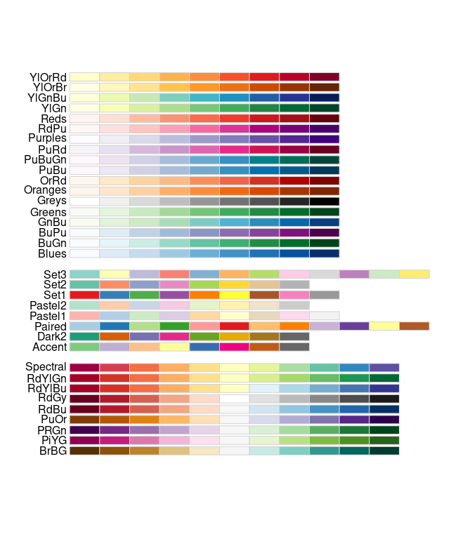
For example to get the R code for the Set1 palette, we can write
dput(RColorBrewer::brewer.pal(Inf, "Set1"))## Warning in RColorBrewer::brewer.pal(Inf, "Set1"): n too large, allowed maximum for palette Set1 is 9
## Returning the palette you asked for with that many colors## c("#E41A1C", "#377EB8", "#4DAF4A", "#984EA3", "#FF7F00", "#FFFF33",
## "#A65628", "#F781BF", "#999999")We can then copy that R code from the terminal and paste it into our text editor
data(WorldBank, package="animint2")
region.colors <-
  c("#E41A1C", "#377EB8", "#4DAF4A", "#984EA3", "#FF7F00", "#FFFF33",
    "#A65628", "#F781BF", "#999999")
names(region.colors) <- levels(WorldBank$region)
region.colors
## East Asia & Pacific (all income levels)
## "#E41A1C"
## Europe & Central Asia (all income levels)
## "#377EB8"
## Latin America & Caribbean (all income levels)
## "#4DAF4A"
## Middle East & North Africa (all income levels)
## "#984EA3"
## North America
## "#FF7F00"
## South Asia
## "#FFFF33"
## Sub-Saharan Africa (all income levels)
## "#A65628"
## <NA>
## "#F781BF"
## <NA>
## "#999999"Then we can use it with scale_color_manual
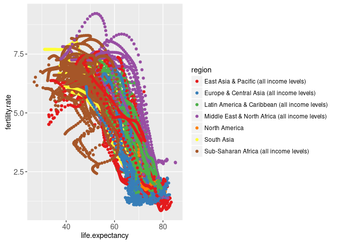
library(animint2)
ggplot()+
  scale_color_manual(values=region.colors)+
  geom_point(aes(
    x=life.expectancy, y=fertility.rate, color=region),
    data=WorldBank)
## Warning: Removed 1490 rows containing missing values (geom_point).