Chapter 17, K-means clustering
In this chapter we will explore several data visualizations of K-means clustering, which is an unsupervised learning algorithm.
Chapter outline:
- We begin by visualizing two features of the iris data.
- We choose three random data points to use as cluster centers.
- We show how all distances between data points and cluster centers can be computed and visualized.
- We end by showing a visualization of how the k-means model parameters change with each iteration.
Visualize iris data with labels
We begin with a typical visualization of the iris data, including a color legend to indicate the Species.
library(animint2)
color.code <- c(
  setosa="#1B9E77",
  versicolor="#D95F02",
  virginica="#7570B3",
  "1"="#E7298A",
  "2"="#66A61E",
  "3"="#E6AB02",
  "4"="#A6761D")
ggplot()+
  scale_color_manual(values=color.code)+
  geom_point(aes(
    Petal.Length, Petal.Width, color=Species),
    data=iris)+
  coord_equal()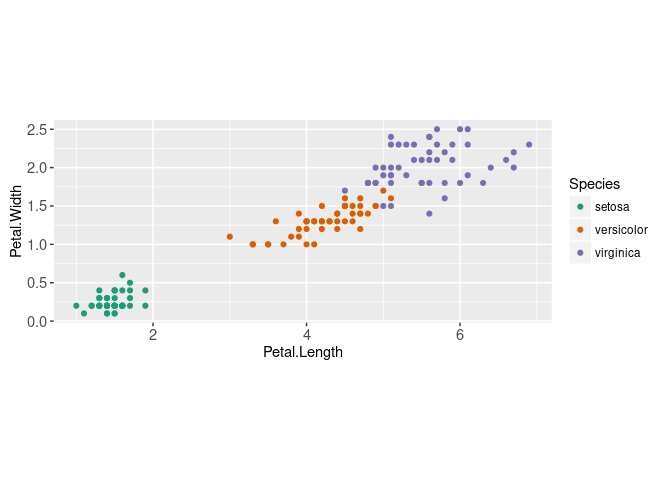
We will illustrate the K-means clustering algorithm using these two dimensions,
data.mat <- as.matrix(iris[,c("Petal.Width","Petal.Length")])
head(data.mat)
## Petal.Width Petal.Length
## [1,] 0.2 1.4
## [2,] 0.2 1.4
## [3,] 0.2 1.3
## [4,] 0.2 1.5
## [5,] 0.2 1.4
## [6,] 0.4 1.7str(data.mat)## num [1:150, 1:2] 0.2 0.2 0.2 0.2 0.2 0.4 0.3 0.2 0.2 0.1 ...
## - attr(*, "dimnames")=List of 2
## ..$ : NULL
## ..$ : chr [1:2] "Petal.Width" "Petal.Length"K-means starts with three random cluster centers
To run K-means, the number of clusters hyper-parameter (K) must be fixed in advance. Then K random data points are selected as the initial cluster centers,
K <- 3
library(data.table)
data.dt <- data.table(data.mat)
set.seed(3)
centers.dt <- data.dt[sample(1:.N, K)]
(centers.mat <- as.matrix(centers.dt))
## Petal.Width Petal.Length
## [1,] 0.2 1.4
## [2,] 2.1 5.4
## [3,] 0.2 1.2centers.dt[, cluster := factor(1:K)]
centers.dt## Petal.Width Petal.Length cluster
## <num> <num> <fctr>
## 1: 0.2 1.4 1
## 2: 2.1 5.4 2
## 3: 0.2 1.2 3gg.centers <- ggplot()+
scale_color_manual(values=color.code)+
geom_point(aes(
Petal.Length, Petal.Width),
color="grey50",
data=data.dt)+
geom_point(aes(
Petal.Length, Petal.Width, color=cluster),
data=centers.dt)+
coord_equal()
gg.centers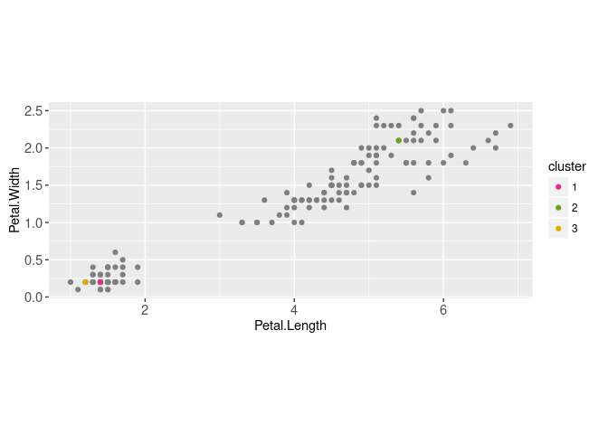
Above we displayed the two data sets (cluster centers and data) using two instances of geom_point. Below we compute the distance between each data point and each cluster center,
pairs.dt <- data.table(expand.grid(
  centers.i=1:nrow(centers.mat),
  data.i=1:nrow(data.mat)))
These can be visualized via a geom_point,
seg.dt <- pairs.dt[, data.table(
  data.i,
  data=data.mat[data.i,],
  center=centers.mat[centers.i,])]
gg.centers+
  geom_segment(aes(
    data.Petal.Length, data.Petal.Width,
    xend=center.Petal.Length, yend=center.Petal.Width),
    size=1,
    data=seg.dt)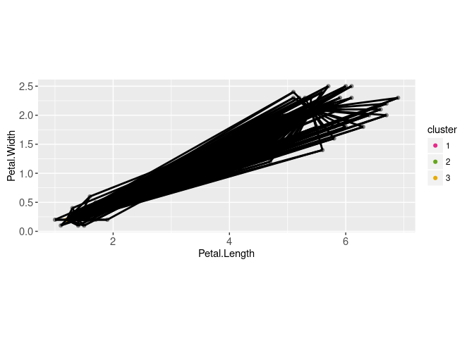
There are 450 segments overplotted above, so interactivity would be useful to emphasize the segments connected to a particular data point. To do that we create a data.i selection variable,
animint(
  ggplot()+
    scale_color_manual(values=color.code)+
    geom_point(aes(
      Petal.Length, Petal.Width, color=cluster),
      size=4,
      data=centers.dt)+
    geom_point(aes(
      Petal.Length, Petal.Width),
      clickSelects="data.i",
      size=2,
      color="grey50",
      data=data.table(data.mat, data.i=1:nrow(data.mat)))+
    coord_equal()+
    geom_segment(aes(
      data.Petal.Length, data.Petal.Width,
      xend=center.Petal.Length, yend=center.Petal.Width),
      size=1,
      showSelected="data.i",
      data=seg.dt)
)
In the data viz above you can click on a data point to show the distances from that data point to each cluster center.
Exercises for this section:
- edit the x/y scales so that the same ticks are shown.
- change the color of each segment so that it matches the corresponding cluster.
- add a tooltip that shows the distance value.
- make the segment width depend on its optimality (segment connected to closest cluster center should be emphasized with greater width).
Visualizing iterations of algorithm
Next we compute the closest cluster center for each data point,
pairs.dt[, error := rowSums((data.mat[data.i,]-centers.mat[centers.i,])^2)]
(closest.dt <- pairs.dt[, .SD[which.min(error)], by=data.i])
## data.i centers.i error
## <int> <int> <num>
## 1: 1 1 0.00
## 2: 2 1 0.00
## 3: 3 1 0.01
## 4: 4 1 0.01
## 5: 5 1 0.00
## ---
## 146: 146 2 0.08
## 147: 147 2 0.20
## 148: 148 2 0.05
## 149: 149 2 0.04
## 150: 150 2 0.18(closest.data <- closest.dt[, .(
data.dt[data.i],
cluster=factor(centers.i)
)])## Petal.Width Petal.Length cluster
## <num> <num> <fctr>
## 1: 0.2 1.4 1
## 2: 0.2 1.4 1
## 3: 0.2 1.3 1
## 4: 0.2 1.5 1
## 5: 0.2 1.4 1
## ---
## 146: 2.3 5.2 2
## 147: 1.9 5.0 2
## 148: 2.0 5.2 2
## 149: 2.3 5.4 2
## 150: 1.8 5.1 2(both.dt <- rbind(
data.table(type="centers", centers.dt),
data.table(type="data", closest.data)))## type Petal.Width Petal.Length cluster
## <char> <num> <num> <fctr>
## 1: centers 0.2 1.4 1
## 2: centers 2.1 5.4 2
## 3: centers 0.2 1.2 3
## 4: data 0.2 1.4 1
## 5: data 0.2 1.4 1
## ---
## 149: data 2.3 5.2 2
## 150: data 1.9 5.0 2
## 151: data 2.0 5.2 2
## 152: data 2.3 5.4 2
## 153: data 1.8 5.1 2ggplot()+
scale_fill_manual(values=color.code)+
scale_color_manual(values=c(centers="black", data="grey"))+
scale_size_manual(values=c(centers=5, data=3))+
geom_point(aes(
Petal.Length, Petal.Width, fill=cluster, size=type, color=type),
shape=21,
data=both.dt)+
coord_equal()+
theme_bw()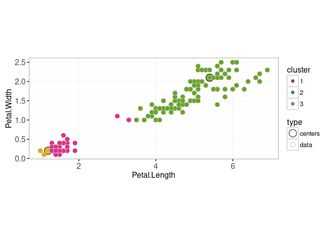
Then we update the cluster centers,
new.centers <- closest.dt[, data.table(
  t(colMeans(data.dt[data.i]))
), by=.(cluster=centers.i)]
(new.both <- rbind(
  data.table(type="centers", new.centers),
  data.table(type="data", closest.data)))
## type cluster Petal.Width Petal.Length
## <char> <fctr> <num> <num>
## 1: centers 1 0.300000 1.595918
## 2: centers 3 0.175000 1.125000
## 3: centers 2 1.695876 4.958763
## 4: data 1 0.200000 1.400000
## 5: data 1 0.200000 1.400000
## ---
## 149: data 2 2.300000 5.200000
## 150: data 2 1.900000 5.000000
## 151: data 2 2.000000 5.200000
## 152: data 2 2.300000 5.400000
## 153: data 2 1.800000 5.100000ggplot()+
scale_fill_manual(values=color.code)+
scale_color_manual(values=c(centers="black", data="grey"))+
scale_size_manual(values=c(centers=5, data=3))+
geom_point(aes(
Petal.Length, Petal.Width, fill=cluster, size=type, color=type),
shape=21,
data=new.both)+
coord_equal()+
theme_bw()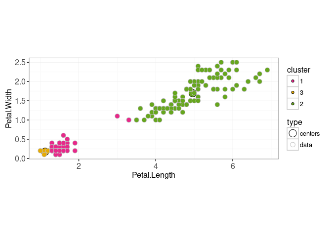
So the visualizations above show the steps of k-means: (1) updating cluster assignment based on closest center, then (2) updating center based on data assigned to that cluster. To visualize several iterations of the above two steps, we can use a for loop,
set.seed(3)
centers.dt <- data.dt[sample(1:.N, K)]
(centers.mat <- as.matrix(centers.dt))
## Petal.Width Petal.Length
## [1,] 0.2 1.4
## [2,] 2.1 5.4
## [3,] 0.2 1.2data.and.centers.list <- list()
iteration.error.list <- list()
for(iteration in 1:20){
pairs.dt[, error := {
rowSums((data.mat[data.i,]-centers.mat[centers.i,])^2)
}]
closest.dt <- pairs.dt[, .SD[which.min(error)], by=data.i]
iteration.error.list[[iteration]] <- data.table(
iteration, error=sum(closest.dt[["error"]]))
iteration.both <- rbind(
data.table(type="centers", centers.dt, cluster=1:K),
closest.dt[, data.table(
type="data", data.dt[data.i], cluster=factor(centers.i))])
data.and.centers.list[[iteration]] <- data.table(
iteration, iteration.both)
new.centers <- closest.dt[, data.table(
t(colMeans(data.dt[data.i]))
), keyby=.(cluster=centers.i)]
centers.dt <- new.centers[, names(centers.dt), with=FALSE]
centers.mat <- as.matrix(centers.dt)
}
(data.and.centers <- do.call(rbind, data.and.centers.list))## iteration type Petal.Width Petal.Length cluster
## <int> <char> <num> <num> <fctr>
## 1: 1 centers 0.2 1.4 1
## 2: 1 centers 2.1 5.4 2
## 3: 1 centers 0.2 1.2 3
## 4: 1 data 0.2 1.4 1
## 5: 1 data 0.2 1.4 1
## ---
## 3056: 20 data 2.3 5.2 2
## 3057: 20 data 1.9 5.0 2
## 3058: 20 data 2.0 5.2 2
## 3059: 20 data 2.3 5.4 2
## 3060: 20 data 1.8 5.1 2(iteration.error <- do.call(rbind, iteration.error.list))## iteration error
## <int> <num>
## 1: 1 123.63000
## 2: 2 85.82705
## 3: 3 85.39540
## 4: 4 85.03012
## 5: 5 84.89709
## 6: 6 84.37089
## 7: 7 82.79109
## 8: 8 80.06290
## 9: 9 67.97395
## 10: 10 50.10450
## 11: 11 39.51052
## 12: 12 33.02404
## 13: 13 31.78261
## 14: 14 31.64232
## 15: 15 31.39541
## 16: 16 31.37136
## 17: 17 31.37136
## 18: 18 31.37136
## 19: 19 31.37136
## 20: 20 31.37136
## iteration errorFirst we create an overview plot with an error curve that will be used to select the model size,
gg.err <- ggplot()+
  theme_bw()+
  geom_point(aes(
    iteration, error),
    data=iteration.error)+
  make_tallrect(iteration.error, "iteration", alpha=0.3)
gg.err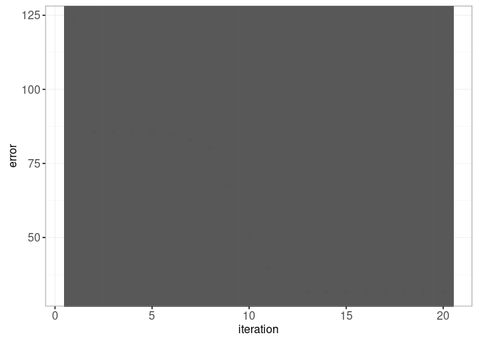
We also make a plot which will show the current iteration,
gg.iteration <- ggplot()+
  scale_fill_manual(values=color.code)+
  scale_color_manual(values=c(centers="black", data=NA))+
  scale_size_manual(values=c(centers=5, data=2))+
  geom_point(aes(
    Petal.Length, Petal.Width, fill=cluster, size=type, color=type),
    shape=21,
    showSelected="iteration",
    data=data.and.centers)+
  coord_equal()+
  theme_bw()
gg.iteration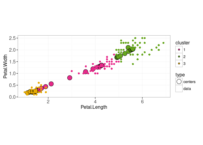
Combining the two plots results in an interactive data viz,
animint(gg.err, gg.iteration)
Chapter summary and exercises
Exercises:
- Make centers always show up in front (on top) of the data.
- Add smooth transitions.
- Add animation on iteration variable.
- Current code has fixed max number of iterations, so it is possible for the last few iterations to make no progress. For example in the viz above, iteration=16 was the last one that resulted in a decrease in error (iterations 17-20 resulted in no decrease). Modify the code so that it stops iterating if there is no decrease in error.
- Current viz has only one animation frame (showSelected subset) per iteration (the mean shown is before it is updated). Add another animation frame that shows the mean after the update.
- Add interactive segments that show the distance from each data point to each cluster center (as in first animint on this page).
- Add the features described in the exercises in the previous section on this page.
- Compute results for several different random seeds, then display error rates for each seed on the error overview plot, and allow the user to select any of those results.
- Compute results for several different numbers of clusters (K). Compute the Adjusted Rand Index using
pdfCluster::adj.rand.index(species, cluster)for each different K and seed. Add an overview plot that shows the ARI value of each model, and allows selecting the number of clusters. - Make a similar visualization using another data set such as
data("penguins", package="palmerpenguins").
Next, Chapter 18 explains how to visualize the gradient descent learning algorithm for neural network learning.
