Chapter 3, the showSelected keyword
This chapter explains showSelected, one of the two main keywords that animint introduces for interactive data visualization. After reading this chapter, you will be able to
- Use the showSelected keyword in your plot sketches to specify geoms for which only a subset of data should be plotted at any time.
- Use selection menus in animint to change the subset of plotted data.
- Specify smooth transitions between data subsets using the duration option and key aesthetic.
- Create animated data visualizations using the time option.
Sketching with showSelected
In this section, we will explain how the showSelected keyword can be used in plot sketches. The showSelected keyword specifies a variable to use for subsetting the data before plotting. Each geom in a data visualization has its own data set, and its own definition of showSelected variables. That means different geoms can specify different data sets and showSelected keywords to show different data subsets.
In fact, we have already used the showSelected keyword, which was automatically created by the interactive legends that we created in the previous two chapters. For example, consider the sketch below of the Keeling Curve data visualization from Chapter 1.
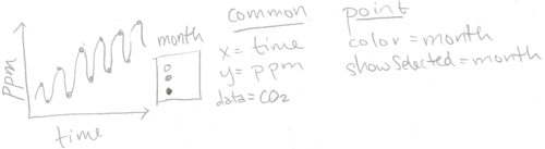
The sketch above includes showSelected=month for the geom_point, meaning that it should show the subset of data for the selected months. In contrast, since the geom_line does not include showSelected keywords, it always shows the entire data set (regardless of the selected months).
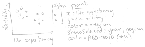
As another example, consider the sketch below of the first WorldBank data visualization from Chapter 2.

The sketch above specifies showSelected=region for the geom_point, meaning that it should show the subset of data for the selected regions.
Note that the code we used in chapter 2 did not explicitly specify showSelected=region. Instead, we specified aes(color=region), and animint automatically assigned a showSelected keyword. In general, animint will assign a showSelected keyword for each variable that is used in a categorical legend.
However, the showSelected keyword is not limited to use with categorical legends. You can use showSelected keywords for any data variables you like, by explicitly specifying the variable names in the showSelected argument of the geom.
Each variable that is used with showSelected is treated by animint as a selection variable. For example, the Keeling Curve data viz has one selection variable (month), and so does the WorldBank data viz (region). For each selection variable, animint keeps track of the currently selected values. When the selection changes, animint updates the subset of data that is shown.
Each of the data visualizations sketched above has only one selection variable. However, a data visualization can have any number of selection variables. In the next section, we will explore a visualization of the World Bank data that has selection variables for region and year.
Selecting data subsets using menus
Consider the following sketch which adds a showSelected variable, and changes the data set.
Note that there are two showSelected variables, region and year. Also note that the data is specified as all years (but only one will be shown at a time due to showSelected=year). Below, we translate this sketch into R code.
library(animint2)
data(WorldBank)
scatter <- ggplot()+
  geom_point(aes(
    x=life.expectancy, y=fertility.rate, color=region),
    showSelected="year",
    data=WorldBank)
scatter
## Warning: Removed 1490 rows containing missing values (geom_point).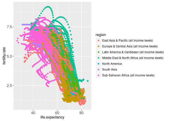
Note that the ggplot above contains the showSelected argument, one of the two main features introduced in animint2. The showSelected keyword is ignored when rendering the plot using the usual R graphics devices, which produce a scatterplot with one point for every country and year. Note that since color=region was specified, animint also automatically uses region as a showSelected variable.
In constrast, rendering the same ggplot using animint yields the interactive data visualization below.
animint(scatter)
Note that the data viz above has two selection variables: region and year. Each variable has a menu at the bottom of the data viz that can be used to change the current selection. In this data viz, these selection menus are shown by default. They can be hidden by clicking the “Hide selection menus” button, and shown again by clicking the “Show selection menus” button.
Discrete legend variables such as region default to multiple selection, so several values are selected and shown at once. Try changing the selected region in the interactive legend and the selection menu. When you change the selection using either method, both the interactive legend and the selection menu should update to reflect the current selection.
We use the terms “direct manipulation” and “indirect manipulation” to describe these different ways of changing the selection. Direct manipulation typically involves clicking on the objects that you want to change, and is usually easier to understand. In contrast, indirect manipulation techniques such as menus are typically more complicated to understand. In the animint above, you can change the value of the region variable using either the legend or the menu. Using the legend is a more direct manipulation technique, since the legend is drawn closer to the plotted data points that will be updated.
Other selection variables such as year default to single selection, so only one value is selected and shown at any time. Try changing the selected value of the year variable using the selection menu. You should see the points in the scatterplot immediately update to show the fertility rate and life expectancy of all the countries in the year that you selected.
Multi-layer exercise: Add another geom to this interactive scatterplot. As in Chapter 2, you can use a geom_text to show the name of each country (easy), or a geom_text to show the selected year (medium), or a geom_path to show the previous 5 years of data (hard). Hint: make sure to specify showSelected=year for all geoms.
Multi-plot exercise: Add a time series plot to the data viz above. As in Chapter 2, you can use a geom_line to show the fertility rate for each country over all years. Add a geom_vline with showSelected=year to highlight the currently selected year.
Transitions: the duration option and key aesthetic
You may have noticed that there are buttons at the bottom of each data visualization created by animint. Try clicking the “Show animation controls” button above. This table contains a row for each selection variable. The text boxes show the number of milliseconds that are used for transition durations after updating each selection variable. The default transition duration for each selection variable is 0, meaning data will be immediately placed at their new positions after updating each variable.
To illustrate the significance of transition durations, try changing the transition duration of the year variable to 2000. Then, change the selected value of the year variable. You should see the data points move slowly to their new positions, over a duration of 2 seconds.
Some transitions result in points moving only a little bit, to nearby positions (e.g. 1979-1980). Other transitions result in points moving a lot more, to far away locations (e.g. 1980-1981). Why is that?
Smooth transitions only make sense for data points that exist both before and after changing the selection. In the R code below we compute a table of counts of data points that can be plotted in each of these three years.
three.years <- subset(WorldBank, 1979 <= year & year <= 1981)
can.plot <- with(three.years, {
  (!is.na(life.expectancy)) & (!is.na(fertility.rate))
})
table(three.years$year, can.plot)
## can.plot
## FALSE TRUE
## 1979 27 187
## 1980 27 187
## 1981 26 188It is clear from the table above that there are 187 points that can be plotted in 1979 and 1980. However, in 1981 there is one more data point, corresponding to a country for which we did not have data in 1980. Below we show the data for that country, Kosovo.
subset(three.years, country=="Kosovo")## iso2c country year fertility.rate life.expectancy population
## 5850 KV Kosovo 1979 NA NA 1491000
## 5851 KV Kosovo 1980 NA NA 1521000
## 5852 KV Kosovo 1981 4.5758 65.93268 1552000
## GDP.per.capita.Current.USD 15.to.25.yr.female.literacy iso3c
## 5850 NA NA KSV
## 5851 NA NA KSV
## 5852 NA NA KSV
## region capital longitude latitude
## 5850 Europe & Central Asia (all income levels) Pristina 20.926 42.565
## 5851 Europe & Central Asia (all income levels) Pristina 20.926 42.565
## 5852 Europe & Central Asia (all income levels) Pristina 20.926 42.565
## income lending
## 5850 Lower middle income IDA
## 5851 Lower middle income IDA
## 5852 Lower middle income IDAIndeed, the table above shows that fertility rate and life expectancy are missing for Kosovo during 1979-1980. Thus it does not make sense to do a smooth transition for countries such as Kosovo which would not be plotted either before or after the transition. How to specify that in the data visualization? In the code below, we use aes(key=country) to specify that the country variable should be used to match data points before and after changing the selection.
scatter.key <- ggplot()+
  geom_point(aes(
    x=life.expectancy, y=fertility.rate, color=region,
    key=country),
    showSelected="year",
    data=WorldBank)
The key aesthetic in the ggplot above is only meaningful for interactive data visualization, so it ignored when rendering with the usual R graphics devices. However, if we render this ggplot using animint2, the country variable will be used to make sure transtion durations are meaningful. To specify a default transition duration for the year variable, we use the duration option in the data viz below.
(viz.duration <- animint(scatter.key, duration=list(year=2000)))
The duration option must be a named list. Each name should be a selection variable, and each value should specify the number of milliseconds to use for a transition duration when the selected value of that variable is changed.
If you click “Show animation controls” in the data viz above, you will see that the text box for the year variable is 2000, as specified in the R code. If you change the selection from 1980 to 1981, you should see a proper transition.
In general the key aesthetic should be specified for all geoms that use showSelected with a variable that appears in the duration option. In this example, we used the duration option to specify a smooth transition for the year variable. Since we use showSelected=year in the geom_point, we also specified the key aesthetic for this geom.
Animation: the time option
The time option is used to specify a variable to use for animation. The code below specifies year as the variable to animate over time, with an update every 2000 milliseconds.
viz.duration.time <- viz.duration
viz.duration.time$time <- list(variable="year", ms=2000)
viz.duration.time
The data visualization above is animated, because the selected year advances every two seconds.
Exercise: make an animated data visualization that does NOT use smooth transitions. Hint: make a list of ggplots that has the time option but no duration option.
Chapter summary and exercises
This chapter explained the showSelected keyword, selection menus, transition durations, and animation.
Exercises:
- Make an improved version of
viz.alignedfrom the previous chapter. Instead of fixing the year at 1975, useshowSelected=yearso that the user can select a year. Add geoms that show the selected year: ageom_texton the scatterplot, and ageom_vlineon the time series. - Translate one of the animation package examples to an animint. Hint: in the code for the animation package there is always a for loop over the time variable. Instead of calling a plotting function inside the for loop, use the list of data tables idiom to store the data that should be plotted. Then use those data along with
showSelectedto create ggplots, and render them using animint.
Next, Chapter 4 explains the clickSelects keyword, which indicates a geom that can be clicked to update a selection variable.
