Chapter 11, Lasso
This goal of this chapter is to create an interactive data visualization that explains the Lasso, a machine learning model for regularized linear regression.
Chapter outline:
- We begin with several static data visualizations of the lasso path.
- We then create an interactive version with a facet and plot showing train/validation error and residuals.
- Finally we re-design the interactive data visualization with simplified legends and moving tallrects.
Static plots of the coefficient regularization path
We begin by loading the prostate cancer data set.
if(!file.exists("prostate.data")){
  download.file(
    "https://web.stanford.edu/~hastie/ElemStatLearn/datasets/prostate.data",
    "prostate.data")
}
prostate <- data.table::fread("prostate.data")
head(prostate)
## V1 lcavol lweight age lbph svi lcp gleason pgg45
## <int> <num> <num> <int> <num> <int> <num> <int> <int>
## 1: 1 -0.5798185 2.769459 50 -1.386294 0 -1.386294 6 0
## 2: 2 -0.9942523 3.319626 58 -1.386294 0 -1.386294 6 0
## 3: 3 -0.5108256 2.691243 74 -1.386294 0 -1.386294 7 20
## 4: 4 -1.2039728 3.282789 58 -1.386294 0 -1.386294 6 0
## 5: 5 0.7514161 3.432373 62 -1.386294 0 -1.386294 6 0
## 6: 6 -1.0498221 3.228826 50 -1.386294 0 -1.386294 6 0
## lpsa train
## <num> <char>
## 1: -0.4307829 T
## 2: -0.1625189 T
## 3: -0.1625189 T
## 4: -0.1625189 T
## 5: 0.3715636 T
## 6: 0.7654678 TWe construct a train inputs x and outputs y using the code below.
input.cols <- c(
  "lcavol", "lweight", "age", "lbph", "svi", "lcp", "gleason",
  "pgg45")
prostate.inputs <- prostate[, ..input.cols]
is.train <- prostate$train == "T"
x <- as.matrix(prostate.inputs[is.train])
head(x)
## lcavol lweight age lbph svi lcp gleason pgg45
## [1,] -0.5798185 2.769459 50 -1.386294 0 -1.386294 6 0
## [2,] -0.9942523 3.319626 58 -1.386294 0 -1.386294 6 0
## [3,] -0.5108256 2.691243 74 -1.386294 0 -1.386294 7 20
## [4,] -1.2039728 3.282789 58 -1.386294 0 -1.386294 6 0
## [5,] 0.7514161 3.432373 62 -1.386294 0 -1.386294 6 0
## [6,] -1.0498221 3.228826 50 -1.386294 0 -1.386294 6 0y <- prostate[is.train, lpsa]
head(y)## [1] -0.4307829 -0.1625189 -0.1625189 -0.1625189 0.3715636 0.7654678Below we fit the full path of lasso solutions using the lars package.
library(lars)
fit <- lars(x,y,type="lasso")
fit$lambda
## [1] 7.1939462 3.7172742 2.9403866 1.7305064 1.7002813 0.4933166 0.3711651
## [8] 0.0403451The path of lambda values are not evenly spaced.
pred.nox <- predict(fit, type="coef")
beta <- scale(pred.nox$coefficients, FALSE, 1/fit$normx)
arclength <- rowSums(abs(beta))
path.list <- list()
for(variable in colnames(beta)){
  standardized.coef <- beta[, variable]
  path.list[[variable]] <- data.table::data.table(
    step=seq_along(standardized.coef),
    lambda=c(fit$lambda, 0),
    variable,
    standardized.coef,
    fraction=pred.nox$fraction,
    arclength)
}
path <- do.call(rbind, path.list)
variable.colors <- c(
  "#E41A1C", "#377EB8", "#4DAF4A", "#984EA3", "#FF7F00", "#FFFF33",
  "#A65628", "#F781BF", "#999999")
library(animint2)
gg.lambda <- ggplot()+
  theme_bw()+
  theme(panel.margin=grid::unit(0, "lines"))+
  scale_color_manual(values=variable.colors)+
  geom_line(aes(
    lambda, standardized.coef, color=variable, group=variable),
    data=path)+
  ggtitle("LASSO path for prostate cancer data calculated using the LARS")
gg.lambda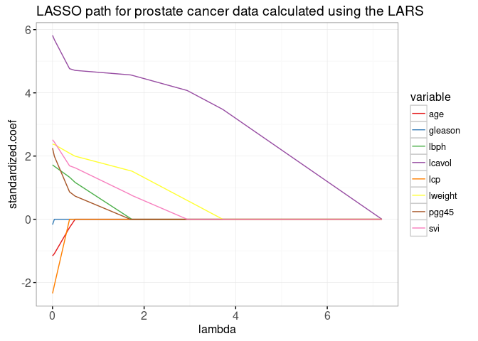
The plot above shows the entire lasso path, the optimal weights in the L1-regularized least squares regression problem, for every regularization parameter lambda. The path begins at the least squares solution, lambda=0 on the left. It ends at the completely regularized intercept-only model on the right. To see the equivalence with the ordinary least squares solution, we add dots in the plot below.
x.scaled <- with(fit, scale(x, meanx, normx))
lfit <- lm.fit(x.scaled, y)
lpoints <- data.table::data.table(
  variable=colnames(x),
  standardized.coef=lfit$coefficients,
  arclength=sum(abs(lfit$coefficients)))
gg.lambda+
  geom_point(aes(
    0, standardized.coef, color=variable),
    data=lpoints)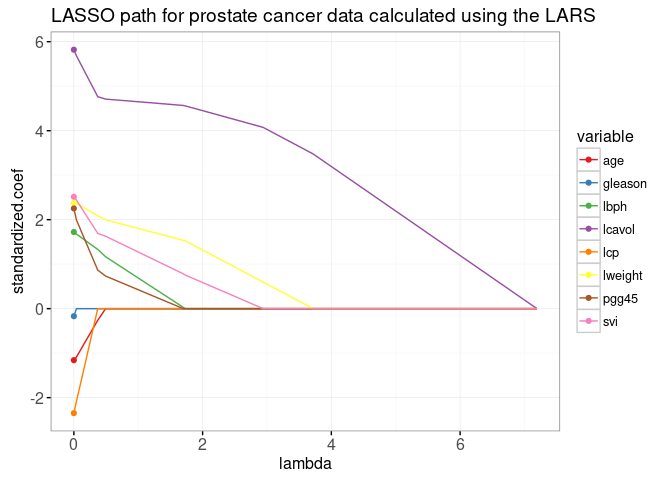
In the next plot below, we show the path as a function of L1 norm (arclength), with some more points on an evenly spaced grid that we will use later for animation.
fraction <- sort(unique(c(
  seq(0, 1, l=21))))
pred.fraction <- predict(
  fit, prostate.inputs,
  type="coef", mode="fraction", s=fraction)
coef.grid.list <- list()
coef.grid.mat <- scale(pred.fraction$coefficients, FALSE, 1/fit$normx)
for(fraction.i in seq_along(fraction)){
  standardized.coef <- coef.grid.mat[fraction.i,]
  coef.grid.list[[fraction.i]] <- data.table::data.table(
    fraction=fraction[[fraction.i]],
    variable=colnames(x),
    standardized.coef,
    arclength=sum(abs(standardized.coef)))
}
coef.grid <- do.call(rbind, coef.grid.list)
ggplot()+
  ggtitle("LASSO path for prostate cancer data calculated using the LARS")+
  theme_bw()+
  theme(panel.margin=grid::unit(0, "lines"))+
  scale_color_manual(values=variable.colors)+
  geom_line(aes(
    arclength, standardized.coef, color=variable, group=variable),
    data=path)+
  geom_point(aes(
    arclength, standardized.coef, color=variable),
    data=lpoints)+
  geom_point(aes(
    arclength, standardized.coef, color=variable),
    shape=21,
    fill=NA,
    size=3,
    data=coef.grid)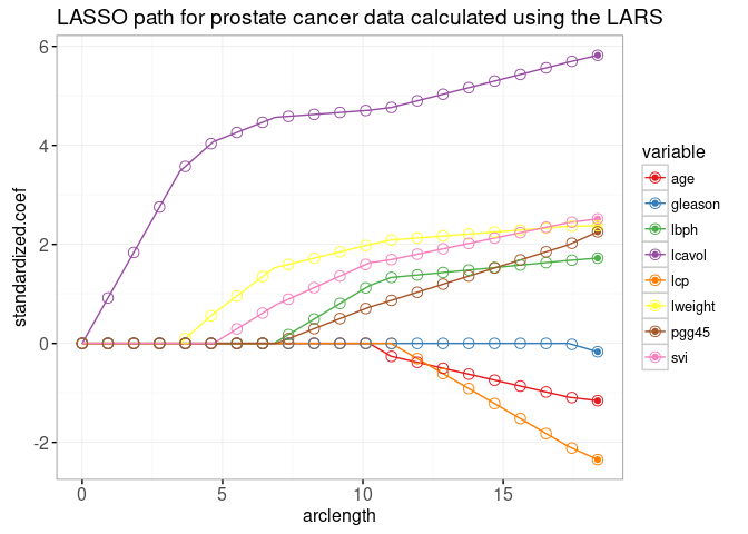
The plot above shows that the weights at the grid points are consistent with the lines that represent the entire path of solutions. The LARS algorithm quickly provides Lasso solutions for as many grid points as you like. More precisely, since the LARS only computes the change-points in the piecewise linear path, its time complexity only depends on the number of change-points (not the number of grid points).
Interactive visualization of the regularization path
The plot below combines the lasso weight path with the train/test error plot.
pred.list <- predict(
  fit, prostate.inputs,
  mode="fraction", s=fraction)
residual.mat <- pred.list$fit - prostate$lpsa
squares.mat <- residual.mat * residual.mat
mean.error.list <- list()
for(set in c("train", "validation")){
  val <- if(set=="train")TRUE else FALSE
  is.set <- is.train == val
  mse <- colMeans(squares.mat[is.set, ])
  mean.error.list[[paste(set)]] <- data.table::data.table(
    set, mse, fraction,
    arclength=rowSums(abs(coef.grid.mat)))
}
mean.error <- do.call(rbind, mean.error.list)
rect.width <- diff(mean.error$arclength[1:2])/2
addY <- function(dt, y){
  data.table::data.table(dt, y.var=factor(y, c("error", "weights")))
}
tallrect.dt <- coef.grid[variable==variable[1],]
gg.path <- ggplot()+
  theme_bw()+
  theme(panel.margin=grid::unit(0, "lines"))+
  facet_grid(y.var ~ ., scales="free")+
  ylab("")+
  scale_color_manual(values=variable.colors)+
  geom_line(aes(
    arclength, standardized.coef, color=variable, group=variable),
    data=addY(path, "weights"))+
  geom_line(aes(
    arclength, mse, linetype=set, group=set),
    data=addY(mean.error, "error"))+
  geom_tallrect(aes(
    xmin=arclength-rect.width,
    xmax=arclength+rect.width),
    clickSelects="arclength",
    alpha=0.5,
    data=tallrect.dt)
print(gg.path)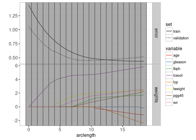
Finally, we add a plot of residuals versus actual values.
lasso.res.list <- list()
for(fraction.i in seq_along(fraction)){
  lasso.res.list[[fraction.i]] <- data.table::data.table(
    observation.i=1:nrow(prostate),
    fraction=fraction[[fraction.i]],
    residual=residual.mat[, fraction.i],
    response=prostate$lpsa,
    arclength=sum(abs(coef.grid.mat[fraction.i,])),
    set=ifelse(prostate$train, "train","validation"))
}
lasso.res <- do.call(rbind, lasso.res.list)
hline.dt <- data.table::data.table(residual=0)
gg.res <- ggplot()+
  theme_bw()+
  geom_hline(aes(
    yintercept=residual),
    data=hline.dt,
    color="grey")+
  geom_point(aes(
    response, residual, fill=set,
    key=observation.i),
    showSelected="arclength",
    shape=21,
    data=lasso.res)
print(gg.res)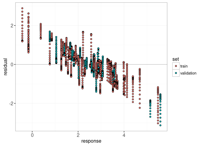
Below, we combine the ggplots above in a single animint below. Clicking the first plot changes the regularization parameter, and the residuals that are shown in the second plot.
animint(
  gg.path,
  gg.res,
  duration=list(arclength=2000),
  time=list(variable="arclength", ms=2000))
Re-design with moving tallrects
The re-design below has two changes. First, you may have noticed that there are two different set legends in the previous animint (linetype=set in the first path plot, and color=set in the second residual plot). It would be easier for the reader to decode if the set variable had just one mapping. So in the re-design below we replace the geom_point in the second plot with a geom_segment with linetype=set.
Second, we have replaced the single tallrect in the first plot with two tallrects. The first tallrect has showSelected=arclength and is used to show the selected arclength using a grey rectangle. Since we specify a duration for the arclength variable, and the same key=1 value, we will observe a smooth transition of the selected grey tallrect. The second tallrect has clickSelects=arclength and so clicking it has the effect of changing the selected value of arclength. We specify a another data set with more rows, and use the named clickSelects/showSelected variables to indicate that arclength should also be used as a showSelected variable.
tallrect.show.list <- list()
for(a in tallrect.dt$arclength){
  is.selected <- tallrect.dt$arclength == a
  not.selected <- tallrect.dt[!is.selected]
  tallrect.show.list[[paste(a)]] <- data.table::data.table(
    not.selected, show.val=a, show.var="arclength")
}
tallrect.show <- do.call(rbind, tallrect.show.list)
animint(
  path=ggplot()+
    theme_bw()+
    theme(panel.margin=grid::unit(0, "lines"))+
    facet_grid(y.var ~ ., scales="free")+
    ylab("")+
    scale_color_manual(values=variable.colors)+
    geom_line(aes(
      arclength, standardized.coef, color=variable, group=variable),
      data=addY(path, "weights"))+
    geom_line(aes(
      arclength, mse, linetype=set, group=set),
      data=addY(mean.error, "error"))+
    geom_tallrect(aes(
      xmin=arclength-rect.width,
      xmax=arclength+rect.width,
      key=1),
      showSelected="arclength",
      alpha=0.5,
      data=tallrect.dt)+
    geom_tallrect(aes(
      xmin=arclength-rect.width,
      xmax=arclength+rect.width,
      key=paste(arclength, show.val)),
      clickSelects="arclength",
      showSelected=c("show.var"="show.val"),
      alpha=0.5,
      data=tallrect.show),
  res=ggplot()+
    theme_bw()+
    geom_hline(aes(
      yintercept=residual),
      data=hline.dt,
      color="grey")+
    guides(linetype="none")+
    geom_point(aes(
      response, residual,
      key=observation.i),
      showSelected=c("set", "arclength"),
      shape=21,
      fill=NA,
      color="black",
      data=lasso.res)+
    geom_text(aes(
      3, 2.5, label=sprintf("L1 arclength = %.1f", arclength),
      key=1),
      showSelected="arclength",
      data=tallrect.dt)+
    geom_text(aes(
      0, -2, label=sprintf("train error = %.3f", mse),
      key=1),
      showSelected=c("set", "arclength"),
      hjust=0,
      data=mean.error[set=="train"])+
    geom_text(aes(
      0, -2.5, label=sprintf("validation error = %.3f", mse),
      key=1),
      showSelected=c("set", "arclength"),
      hjust=0,
      data=mean.error[set=="validation"])+
    geom_segment(aes(
      response, residual,
      xend=response, yend=0,
      linetype=set,
      key=observation.i),
      showSelected=c("set", "arclength"),
      size=1,
      data=lasso.res),
  duration=list(arclength=2000),
  time=list(variable="arclength", ms=2000))
Chapter summary and exercises
We created a visualization of the Lasso machine learning model, which simulataneously shows the regularization path and error curves. Interactivity was used to show details for different values of the regularization parameter.
Exercises:
- Re-make this data viz, including the same visual effect for the tallrects, using only one
geom_tallrect. Hint: create another data set withexpand.grid(arclength.click=arclength, arclength.show=arclength), as in the definition of themake_tallrect_or_widerectfunction. - Add another scatterplot that shows predicted values versus response, with a
geom_ablinein the background to indicate perfect prediction. - How would the error curves look if other train/validation splits were chosen? Perform 4-fold cross-validation and add a plot that can be used to select test fold.
Next, Chapter 12 explains how to visualize the Support Vector Machine.
