Chapter 2, data visualization using the grammar of graphics
This chapter explains the grammar of graphics, which is a powerful model for describing a large class of data visualizations. After reading this chapter, you will be able to
- State the advantages of the grammar of graphics relative to previous plotting systems
- Install the animint2 R package
- Translate plot sketches into ggplot code in R
- Render ggplots on web pages using animint2
- Create multi-layer ggplots
- Create multi-panel ggplots
History and purpose of the grammar of graphics
Most computer systems for data analysis provide functions for creating plots to visualize patterns in data. The oldest systems provide very general functions for drawing basic plot components such as lines and points (e.g. the graphics and grid packages in R). If you use one of these general systems, then it is your job to put the components together to form a meaningful, interpretable plot. The advantage of general systems is that they impose few limitations on what kinds of plots can be created. The disadvantage is that general systems typically do not provide functions for automating common plotting tasks (axes, panels, legends).
To overcome the disadvantages of these general plotting systems, charting packages such as lattice were developed (Sarkar, 2008). Such packages have several pre-defined chart types, and provide a dedicated function for creating each chart type. For example, lattice provides the bwplot function for making box and whisker plots. The advantage of such systems is that they make it much easier to create entire plots, including a legend and panels. The disadvantage is the set of pre-defined chart types, which means that it is not easy to create more complex graphics.
Newer plotting systems based on the grammar of graphics are situated between these two extremes. Wilkinson proposed the grammar of graphics in order to describe and create a large class of plots (Wilkinson, 2005). Wickham later implemented several ideas from the grammar of graphics in the ggplot2 R package (Wickham, 2009). The ggplot2 package has several advantages with respect to previous plotting systems.
- Like general plotting systems, and unlike
lattice,ggplot2imposes few limitations on the types of plots that can be created (there are no pre-defined chart types). - Unlike general plotting systems, and like
lattice,ggplot2makes it easy to include common plot elements such as axes, panels, and legends. - Since
ggplot2is based on the grammar of graphics, an explicit mapping of data variables to visual properties is required. Later in this chapter, we will explain how this mapping allows sketches of plot ideas to be directly translated into R code.
Finally, all of the previously discussed plotting systems are intended for creating static graphics, which can be viewed equally well on a computer screen or on paper. However, the main topic of this manual is animint2, an R package for interactive graphics. In contrast to static graphics, interactive graphics are best viewed on a computer with a mouse and keyboard that can be used to interact with the plot.
Since many concepts from static graphics are also useful in interactive graphics, the animint2 package is implemented as an extension/fork of ggplot2. In this chapter we will introduce the main features of ggplot2 which will also be useful for interactive plot design in later chapters.
In 2013, we created the animint package, which depends on the ggplot2 package. However during 2014-2017, the ggplot2 package introduced many changes that were incompatible with the interactive grammar of animint. Therefore in 2018 we created the animint2 package which copies/forks the relevant parts of the ggplot2 package. Now animint2 can be used without having ggplot2 installed. In fact, it is recommended to use animint2 without attaching (via library) ggplot2. However it is fine to use animint2 along with packages that import/load ggplot2. For an example, see Chapter 16, which uses the penaltyLearning package (which imports ggplot2).
Installing and attaching animint2
To install the most recent release of animint2 from CRAN,
if(!requireNamespace("animint2"))install.packages("animint2")To install an even more recent development version of animint2 from GitHub,
if(!requireNamespace("animint2")){
  if(!requireNamespace("remotes"))install.packages("remotes")
  remotes::install_github("tdhock/animint2")
}
Once you have installed animint2, you can load and attach all of its exported functions via:
library(animint2)Translating plot sketches into ggplots
This section explains how to translate a plot sketch into R code. We use a data set from the World Bank as an example, and we begin by loading and looking at a subset these data.
data(WorldBank, package="animint2")
WorldBank$Region <- sub(" (all income levels)", "", WorldBank$region, fixed=TRUE)
head(WorldBank)
## iso2c country year fertility.rate life.expectancy population
## 266 AD Andorra 1960 NA NA 13414
## 267 AD Andorra 1961 NA NA 14376
## 268 AD Andorra 1962 NA NA 15376
## 269 AD Andorra 1963 NA NA 16410
## 270 AD Andorra 1964 NA NA 17470
## 271 AD Andorra 1965 NA NA 18551
## GDP.per.capita.Current.USD 15.to.25.yr.female.literacy iso3c
## 266 NA NA AND
## 267 NA NA AND
## 268 NA NA AND
## 269 NA NA AND
## 270 NA NA AND
## 271 NA NA AND
## region capital longitude
## 266 Europe & Central Asia (all income levels) Andorra la Vella 1.5218
## 267 Europe & Central Asia (all income levels) Andorra la Vella 1.5218
## 268 Europe & Central Asia (all income levels) Andorra la Vella 1.5218
## 269 Europe & Central Asia (all income levels) Andorra la Vella 1.5218
## 270 Europe & Central Asia (all income levels) Andorra la Vella 1.5218
## 271 Europe & Central Asia (all income levels) Andorra la Vella 1.5218
## latitude income lending Region
## 266 42.5075 High income: nonOECD Not classified Europe & Central Asia
## 267 42.5075 High income: nonOECD Not classified Europe & Central Asia
## 268 42.5075 High income: nonOECD Not classified Europe & Central Asia
## 269 42.5075 High income: nonOECD Not classified Europe & Central Asia
## 270 42.5075 High income: nonOECD Not classified Europe & Central Asia
## 271 42.5075 High income: nonOECD Not classified Europe & Central Asiatail(WorldBank)## iso2c country year fertility.rate life.expectancy population
## 13033 ZW Zimbabwe 2007 3.491 45.79707 12740160
## 13034 ZW Zimbabwe 2008 3.428 47.07061 12784041
## 13035 ZW Zimbabwe 2009 3.360 48.45049 12888918
## 13036 ZW Zimbabwe 2010 3.290 49.86088 13076978
## 13037 ZW Zimbabwe 2011 3.219 51.23644 13358738
## 13038 ZW Zimbabwe 2012 NA NA 13724317
## GDP.per.capita.Current.USD 15.to.25.yr.female.literacy iso3c
## 13033 415.3755 NA ZWE
## 13034 345.4074 NA ZWE
## 13035 475.8538 NA ZWE
## 13036 568.4275 99.55316 ZWE
## 13037 722.8377 NA ZWE
## 13038 787.9382 NA ZWE
## region capital longitude latitude
## 13033 Sub-Saharan Africa (all income levels) Harare 31.0672 -17.8312
## 13034 Sub-Saharan Africa (all income levels) Harare 31.0672 -17.8312
## 13035 Sub-Saharan Africa (all income levels) Harare 31.0672 -17.8312
## 13036 Sub-Saharan Africa (all income levels) Harare 31.0672 -17.8312
## 13037 Sub-Saharan Africa (all income levels) Harare 31.0672 -17.8312
## 13038 Sub-Saharan Africa (all income levels) Harare 31.0672 -17.8312
## income lending Region
## 13033 Low income Blend Sub-Saharan Africa
## 13034 Low income Blend Sub-Saharan Africa
## 13035 Low income Blend Sub-Saharan Africa
## 13036 Low income Blend Sub-Saharan Africa
## 13037 Low income Blend Sub-Saharan Africa
## 13038 Low income Blend Sub-Saharan Africadim(WorldBank)## [1] 11342 16The WorldBank data set consist of measures such as fertility rate and life expectancy for each country over the period 1960-2010. The code above prints the first and last few rows, and the dimension of the data table (11342 rows and 16 columns).
Suppose that we are interested to see if there is any relationship between life expectancy and fertility rate. We could fix one year, then use those two data variables in a scatterplot. Consider the figure below which sketches the main components of that data visualization.
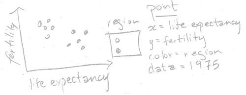
The sketch above shows life expectancy on the horizontal (x) axis, fertility rate on the vertical (y) axis, and a legend for the region. These elements of the sketch can be directly translated into R code using the following method. First, we need to construct a data table that has one row for every country in 1975, and columns named life.expectancy, fertility.rate, and region. The WorldBank data already has these columns, so all we need to do is consider the subset for the year 1975:
WorldBank1975 <- subset(WorldBank, year==1975)
head(WorldBank1975)
## iso2c country year fertility.rate life.expectancy population
## 281 AD Andorra 1975 NA NA 30706
## 334 AE United Arab Emirates 1975 6.009 66.18539 532742
## 387 AF Afghanistan 1975 7.692 37.25712 12551790
## 440 AG Antigua and Barbuda 1975 NA NA 69253
## 493 AL Albania 1975 4.417 68.32583 2426592
## 546 AM Armenia 1975 2.745 70.52751 2825650
## GDP.per.capita.Current.USD 15.to.25.yr.female.literacy iso3c
## 281 7168.3987 NA AND
## 334 27631.8985 56.27697 ARE
## 387 188.5521 NA AFG
## 440 NA NA ATG
## 493 NA NA ALB
## 546 NA NA ARM
## region capital longitude
## 281 Europe & Central Asia (all income levels) Andorra la Vella 1.5218
## 334 Middle East & North Africa (all income levels) Abu Dhabi 54.3705
## 387 South Asia Kabul 69.1761
## 440 Latin America & Caribbean (all income levels) Saint John's -61.8456
## 493 Europe & Central Asia (all income levels) Tirane 19.8172
## 546 Europe & Central Asia (all income levels) Yerevan 44.509
## latitude income lending Region
## 281 42.5075 High income: nonOECD Not classified Europe & Central Asia
## 334 24.4764 High income: nonOECD Not classified Middle East & North Africa
## 387 34.5228 Low income IDA South Asia
## 440 17.1175 Upper middle income IBRD Latin America & Caribbean
## 493 41.3317 Upper middle income IBRD Europe & Central Asia
## 546 40.1596 Lower middle income Blend Europe & Central AsiaThe code above prints the data for 1975, which clearly has the appropriate columns, and one row for each country. The next step is to use the notes in the sketch to code a ggplot with a corresponding aes or aesthetic mapping of data variables to visual properties:
scatter <- ggplot()+
  geom_point(
    mapping=aes(x=life.expectancy, y=fertility.rate, color=Region),
    data=WorldBank1975)
scatter
## Warning: Removed 27 rows containing missing values (geom_point).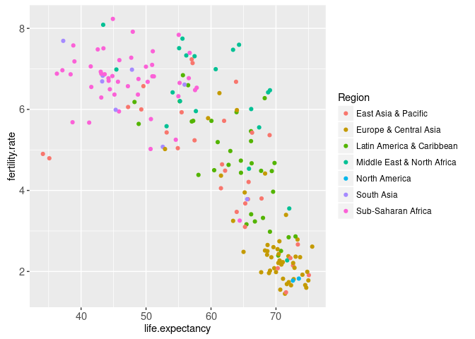
The aes function is called with names for visual properties (x, y, color) and values for the corresponding data variables (life.expectancy, fertility.rate, region). This mapping is applied to the variables in the WorldBank1975 data table, in order to create the visual properties of the geom_point. The ggplot was saved as the scatter object, which when printed on the R command line shows the plot on a graphics device. Note that we automatically have a region color legend.
Rendering ggplots on web pages using animint
This section explains how the animint2 package can be used to render ggplots on web pages. The ggplot from the previous section can be rendered with animint2, by using the animint function.
animint(scatter)
If, when you run the code above, the animint does not render in your web browser for some reason (for example if you see a blank web page), then please consult our wiki FAQ which will help you find a solution. Internally, the animint function creates a list of class animint, and then R runs the print.animint function via the S3 object system. The animint2 package implements a compiler that takes the list as input, and outputs a web page with a data visualization. The compiler is the animint2dir function, which compiles the animint scatter.viz list to a directory of data and code files that can be rendered in a web browser. It is activated automatically by the print.animint function.
When viewed in a web browser, the animint plot should look mostly the same as static versions produced by standard R graphics devices. One difference is that the region legend is interactive: clicking a legend entry will hide or show the points of that color.
Exercise: try changing the aes mapping of the ggplot, and then making a new animint. Quantitative variables like population are best shown using the x/y axes or point size. Qualitative variables like lending are best shown using point color or fill.
Multi-layer data visualization (multiple geoms)
Multi-layer data visualization is useful when you want to display several different geoms or data sets in the same plot. For example, consider the following sketch which adds a geom_path to the previous data visualization.
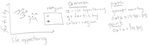
Note how the sketch above includes two different geoms (point and path). The two geoms share a common definition of the x, y, and color aesthetics, but have different data sets. Below we translate this sketch into R code.
WorldBankBefore1975 <- subset(WorldBank, 1970 <= year & year <= 1975)
two.layers <- scatter+
  geom_path(aes(
    x=life.expectancy,
    y=fertility.rate,
    color=Region,
    group=country),
    data=WorldBankBefore1975)
(viz.two.layers <- animint(two.layers))
Note that we save the return value of the animint function to the viz.two.layers object (which is also printed due to the parentheses). In this manual we will often use variable names that start with viz to denote animint data visualization objects, which are in fact lists of ggplots and options.
The plot above shows a data visualization with 2 geoms/layers:
- the
geom_pointshows the life expectancy, fertility rate, and region of all countries in 1975. - the
geom_pathshows the same variables for the previous 5 years.
The addition of the geom_path shows how the countries changed over time. In particular, it shows that most countries moved to the right and down, meaning higher life expectancy and lower fertility rate. However, there are some exceptions. For example, the two East Asian countries in the bottom left suffered a decrease in life expectancy over this period. And there are some countries which showed an increased fertility rate.
Exercise: try changing the region legend to an income legend. Hint: you need to use the same aes(color=income) specification for all geoms. You may want to use scale_color_manual with a sequential color palette, see RColorBrewer::display.brewer.all(type="seq") and read the appendix for more details.
Can we add the names of the countries to the data viz? Below, we add another layer with a text label for each country’s name.
three.layers <- two.layers+
  geom_text(aes(
    x=life.expectancy,
    y=fertility.rate,
    color=Region,
    label=country),
    data=WorldBank1975)
animint(three.layers)
This data viz is not so easy to read, since there are so many overlapping text labels. The interactive region legend helps a little, by allowing the user to hide data from selected regions. However, it would be even better if the user could show and hide the text for individual countries. That type of interaction can be achieved using the showSelected and clickSelects parameters, which we explain in Chapters 3-4.
Exercise: Re-make this data visualization using aes(tooltip), which is a new feature in animint2 (not present in ggplot2), and is discussed in Chapter 5. Set aes(tooltip=country) so that the country name will be visible when you hover the cursor over the corresponding geom.
Next, we move on to discuss a major strength of animint: data visualization with multiple linked plots.
Multi-plot data visualization
Multi-plot data visualization is useful when you want to show some related data sets using more than one aesthetic mapping. In interactive data visualization, one plot is often used to display a summary, and another plot is used to display details. For example, consider a data visualization with two plots: a time series with World Bank data from 1960-2010 (summary), and a scatterplot with data from 1975 (details). We sketch the time series plot below.
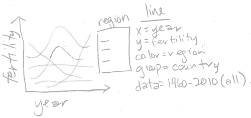
Note how the sketch above can be directly translated into the R code below. For simplicity, we first down-sample the data set to every five years (some web browsers like chromium are not able to display 10,000+ data points at once),
WorldBankSome <- subset(WorldBank, year %% 5 == 0)
dim(WorldBankSome)
## [1] 2354 16table(WorldBankSome$year)##
## 1960 1965 1970 1975 1980 1985 1990 1995 2000 2005 2010
## 214 214 214 214 214 214 214 214 214 214 214The table above shows that there are 214 rows for each of the years in the data set. Next we copy the existing viz list (viz.two.layers), then we assign a ggplot to a new element named timeSeries.
viz.two.plots <- viz.two.layers
viz.two.plots$timeSeries <- ggplot()+
  geom_line(aes(
    x=year,
    y=fertility.rate,
    color=Region,
    group=country),
    data=WorldBankSome)
That results in a named list of two elements (both elements are ggplots with class gganimint).
summary(viz.two.plots)## Length Class Mode
## plot1 9 gganimint list
## timeSeries 9 gganimint listThis data visualization list can be printed/rendered by typing its name. Since the list contains two ggplots, animint2 renders the data viz as two linked plots.
viz.two.plots
The data visualization above contains two ggplots, which each map different data variables to the horizontal x axis. The time series uses aes(x=year), and shows a summary of fertility rate values over all years. The scatterplot uses aes(x=life.expectancy), and shows details of the relationship between fertility rate and life expectancy during 1975.
Try clicking a legend entry in either the scatterplot or the time series above. You should see the data and legends in both plots update simultaneously. Since aes(color=Region) was specified in both plots, animint creates a single shared selector variable called Region. Clicking either legend has the effect of updating the set of selected regions, and so animint updates the legends and data in both plots accordingly. This is the main mechanism that animint uses to create interactive data visualizations with linked plots, and will be discussed in more detail in the next two chapters.
Exercise: use animint to create a data viz with three plots, by creating a list with three ggplots. For example, you could add a time series of another data variable such as life.expectancy or population.
Note that both ggplots map the fertility rate variable to the y axis. However, since they are separate plots, the ranges of their y axes are computed separately. That means that even when the two plots are rendered side-by-side, the two y axis are not exactly aligned. That is a problem since it would make it easier to decode the data visualization if each unit of vertical space was used to show the same amount of fertility rate. To achieve that effect, we use facets in the next section.
Multi-panel data visualization (facets)
Panels or facets are sub-plots that show related data visualizations. One of the main strengths of ggplots is that different kinds of multi-panel plots are relatively easy to create. Multi-panel data visualization is useful for two different purposes:
- You want to align the axes of several related plots containing different geoms. This facilitates comparison between several different geoms, and is a technique that is also useful for interactive data visualization.
- You want to divide the data from one geom into several panels. This facilitates comparison between data subsets, and is less useful for interactive data visualization (interactivity can often be used instead, to achieve the same effect of comparing data subsets).
Different geoms in each panel (aligned axes)
We begin by explaining the how facets are useful to align the axes of related plots. Consider the sketch below which contains a plot with two panels.
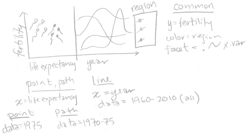
Note that the two panels plot different geoms using a panel-specific aesthetic mapping. The point and path in the left panel have x=life.expectancy, and the line in the right panel has x=year. Also note that we specified facet=x.var, so we need to add a variable called x.var to each of the three data sets. We translate this sketch to the R code below.
add.x.var <- function(df, x.var){
  data.frame(df, x.var=factor(x.var, c("life expectancy", "year")))
}
(viz.aligned <- animint(
  scatter=ggplot()+
    theme_bw()+
    theme_animint(width=600)+
    geom_point(aes(
      x=life.expectancy, y=fertility.rate, color=Region),
      data=add.x.var(WorldBank1975, "life expectancy"))+
    geom_path(aes(
      x=life.expectancy, y=fertility.rate, color=Region,
      group=country),
      data=add.x.var(WorldBankBefore1975, "life expectancy"))+
    geom_line(aes(
      x=year, y=fertility.rate, color=Region, group=country),
      data=add.x.var(WorldBankSome, "year"))+
    xlab("")+
    facet_grid(. ~ x.var, scales="free")))
The data visualization above contains a single ggplot with two panels and three layers. The left panel shows the geom_point and geom_path, and the right panel shows the geom_line. The panels have a shared axis for fertility rate, which ensures that the lines in the time series panel can be directly compared with the points and paths in the scatterplot panel.
Note that we used the add.x.var function to add a x.var variable to each data set, and then we used that variable in facet_grid(scales="free"). We call this the addColumn then facet idiom, which is generally useful for creating a multi-panel data visualization with aligned axes. In particular, if we wanted to change the order of the panels in the data visualization, we would only need to edit the order of the factor levels in the definition of add.x.var.
Also note that theme_bw means to use black panel borders and white panel backgrounds, and panel.margin=0 means to use no space between panels. Eliminating the space between panels means that more space will be used for the panels, which serves to emphasize the data. We call this the Space saving facets idiom, which is generally useful in any ggplot with facets.
In the data viz above, the text labels overlap a bit, which can be fixed by either (exercise for the reader)
- using
breaksargument ofscale_x_continuous() - reducing text size with
theme()andelement_text() - increasing plot width using
theme_animint(), see Chapter 6 for more info.
Same geoms in each panel (compare data subsets)
The second reason for using plots with multiple panels in a data visualization is to compare subsets of observations. This facilitates comparison between data subsets, and can be used in at least two different situations:
- One geom’s data set has too many observations to display informatively in one panel.
- You want to compare different subsets of data that is plotted for one geom.
For example, consider the sketch below.
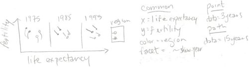
Note that the three panels plot the same two geoms (point and path). Since facet=show.year, and there are three panels shown, we will need to create data tables which have three values for the show.year variable. The geom_point has data for just 3 years, and the geom_path has data for 15 years (but 3 values of show.year). The code below creates these two data sets for three years of the WorldBank data set.
show.point.list <- list()
show.path.list <- list()
for(show.year in c(1975, 1985, 1995)){
  show.point.list[[paste(show.year)]] <- data.frame(
    show.year, subset(WorldBank, year==show.year))
  show.path.list[[paste(show.year)]] <- data.frame(
    show.year, subset(WorldBank, show.year - 5 <= year & year <= show.year))
}
show.point <- do.call(rbind, show.point.list)
show.path <- do.call(rbind, show.path.list)
We used a for loop over three values of show.year, the variable which we will use later in facet_grid. For each value of show.year, we store a data subset as a named element of a list. After the for loop, we use do.call with rbind to combine the data subsets. This is an example of the list of data tables idiom, which is generally useful for interactive data visualization.
Below, we facet on the show.year variable to create a data visualization with three panels.
animint(
  scatter=ggplot()+
    geom_point(aes(
      x=life.expectancy, y=fertility.rate, color=Region),
      data=show.point)+
    geom_path(aes(
      x=life.expectancy, y=fertility.rate, color=Region,
      group=country),
      data=show.path)+
    facet_grid(. ~ show.year)+
    theme_bw())
The data visualization above contains a single ggplot with three panels. It shows more of the WorldBank data set than the previous visualizations which showed only the data from 1975. However, it still only shows a relatively small data subset. You may be tempted to try using a panel to display every year (not just 1975, 1985, and 1995). However, beware that this type of multi-panel data visualization is especially useful if there are only a few data subsets. With more than about 10 panels, it becomes difficult to see all the data at once, and thus difficult to make meaningful comparisons.
Instead of showing all of the data at once, we can instead create an animated data visualization that shows the viewer different data subsets over time. In the next chapter, we will show how the new showSelected keyword can be used to achieve animation, and reveal more details of this data set.
Chapter summary and exercises
This chapter presented the basics of static data visualization using ggplot2. We showed how animint can be used to render a list of ggplots in a web browser. We explained two features of ggplot2 that make it ideal for data visualization: multi-layer and multi-panel graphics.
Exercises:
- What are the three main advantages of
ggplot2relative to previous plotting systems such asgridandlattice? - What is the purpose of multi-layer graphics?
- Create a version of
viz.two.layerswithaes(tooltip)computed based on the min/max values of the data shown by thegeom_path. Hint: for each country inWorldBankBefore1975, compute a text string to use foraes(tooltip). One way to do this is viadata.table(WorldBankBefore1975)[, .(tooltip=sprintf(...)), by=country]. - What are the two different reasons for creating multi-panel graphics? Which of these two types is more useful with interactivity?
Let us define “A < B” to mean that “one B can contain several A.” Which of the following statements is true?
- ggplot < panel
- panel < ggplot
- ggplot < animint
- animint < ggplot
- layer < panel
- panel < layer
- layer < ggplot
- ggplot < layer
- In the
viz.alignedfacets, why is it important to use thescales="free"argument? - In
viz.alignedwe showed a ggplot with a scatterplot panel on the left and a time series panel on the right. Make another version of the data visualization with the time series panel on the left and the scatterplot panel on the right. - In
viz.alignedthe scatterplot displays fertility rate and life expectancy, but the time series displays only fertility rate. Make another version of the data visualization that shows both time series. Hint: use both horizontal and vertical panels infacet_grid. - Use
aes(size=population)in the scatterplot to show the population of each country. Hint:scale_size_animint(pixel.range=c(5, 10)means that circles with a radius of 5/10 pixels should be used represent the minimum/maximum population. - Create a multi-panel data visualization that shows each year of the
WorldBankdata set in a separate panel. What are the limitations of using static graphics to visualize these data? Create
viz.alignedusing a plotting system that is not based on the grammar of graphics. For example, you can use functions from thegraphicspackage in R (plot,points,lines, etc), or matplotlib in Python. What are some advantages of ggplot2 and animint?
Next, Chapter 3 explains the showSelected keyword, which indicates a variable to use for subsetting the data before plotting.
