Chapter 13, Poisson regression
This goal of this chapter is to create an interactive data visualization that explains Poisson regression, a machine learning model for predicting an integer-valued output from inputs that are real-valued vectors. This is a “linear regression” model since it learns a linear function from the inputs to the output. Like least squares regression, Poisson regression can be formulated as a maximum likelihood problem. However, it differs from least squares linear regression since it uses a Poisson distribution to model the output labels, instead of a Gaussian distribution. This modeling choice is appropriate when output labels are non-negative integers.
Chapter outline:
- We begin by creating a plot that shows the probability mass function for a Poisson distribution mean parameter that can be interactively selected.
- We then add a second panel that shows the cumulative distribution function.
- We then add a second plot which shows the Poisson loss, with a second selector for label value.
Plot the probability mass function and select the Poisson mean parameter
The goal of this section is to create a data visualization that shows the probability mass function for a selected Poisson mean parameter.
library(data.table)
poisson.mean.diff <- 0.25
poisson.mean.vec <- seq(0, 5, by=poisson.mean.diff)
quantile.max <- 0.99
poisson.prob.list <- list()
for(poisson.mean in poisson.mean.vec){
  label.max <- qpois(quantile.max, poisson.mean)
  label <- 0:label.max
  probability <- dpois(label, poisson.mean)
  poisson.prob.list[[paste(poisson.mean)]] <- data.table(
    poisson.mean,
    label,
    probability,
    cum.prob=cumsum(probability))
}
poisson.prob <- do.call(rbind, poisson.prob.list)
poisson.prob
## poisson.mean label probability cum.prob
## <num> <int> <num> <num>
## 1: 0.00 0 1.000000000 1.0000000
## 2: 0.25 0 0.778800783 0.7788008
## 3: 0.25 1 0.194700196 0.9735010
## 4: 0.25 2 0.024337524 0.9978385
## 5: 0.50 0 0.606530660 0.6065307
## ---
## 152: 5.00 7 0.104444863 0.8666283
## 153: 5.00 8 0.065278039 0.9319064
## 154: 5.00 9 0.036265577 0.9681719
## 155: 5.00 10 0.018132789 0.9863047
## 156: 5.00 11 0.008242177 0.9945469The static data viz below shows one facet for each Poisson distribution.
mean.tallrects <- data.table(
  poisson.mean=poisson.mean.vec,
  min=poisson.mean.vec - poisson.mean.diff/2,
  max=poisson.mean.vec + poisson.mean.diff/2)
library(animint2)
prob.mass <- ggplot()+
  theme_bw()+
  theme(panel.margin=grid::unit(0, "cm"))+
  geom_tallrect(aes(
    xmin=min, xmax=max),
    clickSelects="poisson.mean",
    alpha=0.6,
    data=mean.tallrects)+
  geom_point(aes(
    label, probability,
    tooltip=sprintf("prob(label = %d) = %f", label, probability)),
    color="red",
    showSelected="poisson.mean",
    size=5,
    data=poisson.prob)
prob.mass+
  facet_wrap("poisson.mean")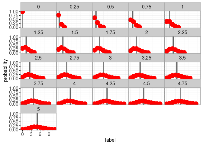
Note that we used alpha=0.6 with geom_tallrect, which means that the tallrect for the selected mean has 0.6 opacity, and the other tallrects have 0.1 opacity. Note also that we use color="red" and size=5 with geom_point so that it is easier to see the points on a grey background, and to hover the cursor over the points to see the tooltip. We next create an interactive version with animint.
animint(prob.mass)
You can click the viz above to change the mean of the Poisson distribution. You can also hover the cursor over a data point to see its probability. Note that for integer values of the Poisson mean, there are two labels that are the most probable (the mode of the Poisson distribution). For example the Poisson distribution with a mean of 3 attains its maximum probability of about 0.224 at label values of 2 and 3.
Add a panel for the cumulative distribution function
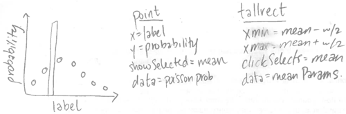
To add a panel for the cumulative distribution function, we will re-make the ggplot based on the sketch below.
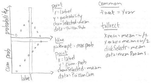
When we specify the data sets, we will use the addColumn then facet idiom to add a panel variable.
addPanel <- function(dt, panel){
  data.table(dt, panel=factor(panel, c("probability", "cum prob")))
}
quantile.max.dt <- data.table(quantile.max)
animint(
  prob=ggplot()+
    theme_bw()+
    theme(panel.margin=grid::unit(0, "cm"))+
    facet_grid(panel ~ ., scales="free")+
    geom_hline(aes(
      yintercept=quantile.max),
      color="grey",
      data=addPanel(quantile.max.dt, "cum prob"))+
    geom_tallrect(aes(
      xmin=min, xmax=max),
      clickSelects="poisson.mean",
      alpha=0.6,
      data=mean.tallrects)+
    geom_point(aes(
      label, probability,
      tooltip=sprintf(
        "prob(label = %d) = %f", label, probability)),
      showSelected="poisson.mean",
      color="red",
      size=5,
      data=addPanel(poisson.prob, "probability"))+
    geom_point(aes(
      label, cum.prob,
      tooltip=sprintf(
        "prob(label <= %d) = %f", label, cum.prob)),
      showSelected="poisson.mean",
      color="red",
      size=5,
      data=addPanel(poisson.prob, "cum prob")))
Note how we used addPanel to add a panel variable to all the data sets for each geom except geom_tallrect. Using panel as a facet variable has the effect of drawing each geom in only one panel, except the geom_tallrect which is drawn in each panel.
Note that we also used a geom_hline to show 0.99, the cumulative distribution function threshold that was used to determine the set of points to plot for each Poisson distribution. This is an example of “show your arbitrary choices,” one of the general principles of designing good interactive data visualizations.
Add a plot of the Poisson loss and a selector for label value
Next we will compute the Poisson loss for several values of the output label.
PoissonLoss <- function(label, seg.mean){
  stopifnot(is.numeric(label))
  stopifnot(is.numeric(seg.mean))
  if(any(seg.mean < 0)){
    stop("PoissonLoss undefined for negative segment mean")
  }
  if(length(seg.mean)==1)seg.mean <- rep(seg.mean, length(label))
  if(length(label)==1)label <- rep(label, length(seg.mean))
  stopifnot(length(seg.mean) == length(label))
  not.integer <- round(label) != label
  is.negative <- label < 0
  loss <- ifelse(
    not.integer | is.negative, Inf,
    ifelse(seg.mean == 0, ifelse(label == 0, 0, Inf),
           seg.mean - label * log(seg.mean)
           ## This term makes all the minima zero.
           -ifelse(label == 0, 0, label - label*log(label))))
  loss
}
Below we compute the loss for several label values, using the list of data tables idiom.
label.vec <- unique(poisson.prob$label)
label.range <- range(label.vec)
mean.vec <- seq(label.range[1], label.range[2], l=100)
loss.min.list <- list()
loss.fun.list <- list()
for(label in label.vec){
  loss <- PoissonLoss(label, mean.vec)
  loss.fun.list[[paste(label)]] <- data.table(
    label, poisson.mean=mean.vec, loss)
  loss.min.list[[paste(label)]] <- data.table(label, loss=0)
}
loss.fun <- do.call(rbind, loss.fun.list)
loss.min <- do.call(rbind, loss.min.list)
We also make a data table to display text labels for the selected mean and label values.
mean.text <- data.table(
  label=max(poisson.prob$label)/2,
  probability=0.95,
  poisson.mean=poisson.mean.vec)
loss.max <- 10
label.text <- data.table(
  poisson.mean=max(mean.tallrects$max),
  loss=loss.max*0.95,
  label=label.vec)
Next we make a data viz with an additional panel.
(viz.loss <- animint(
  prob=ggplot()+
    theme_bw()+
    theme(panel.margin=grid::unit(0, "cm"))+
    facet_grid(panel ~ ., scales="free")+
    geom_text(aes(
      label, probability, label=sprintf(
      "Poisson mean = %.2f", poisson.mean)),
      color="red",
      showSelected="poisson.mean",
      data=addPanel(mean.text, "probability"))+
    geom_hline(aes(
      yintercept=quantile.max),
      color="grey",
      data=addPanel(quantile.max.dt, "cum prob"))+
    geom_point(aes(
      label, probability,
      tooltip=sprintf(
        "prob(label = %d) = %f", label, probability)),
      showSelected="poisson.mean",
      clickSelects="label",
      color="red",
      size=5,
      alpha=0.7,
      data=addPanel(poisson.prob, "probability"))+
    geom_point(aes(
      label, cum.prob,
      tooltip=sprintf(
        "prob(label <= %d) = %f", label, cum.prob)),
      color="red",
      showSelected="poisson.mean",
      clickSelects="label",
      size=5,
      alpha=0.7,
      data=addPanel(poisson.prob, "cum prob")),
  loss=ggplot()+
    theme_bw()+
    geom_text(aes(
      poisson.mean, loss,
      label=sprintf("label = %d", label)),
      showSelected="label",
      hjust=0,
      data=label.text)+
    geom_line(aes(
      poisson.mean, loss),
      showSelected="label",
      data=loss.fun)+
    geom_point(aes(
      label, loss),
      showSelected="label",
      data=loss.min)+
    geom_tallrect(aes(
      xmin=min, xmax=max),
      clickSelects="poisson.mean",
      alpha=0.6,
      data=mean.tallrects)))
The data viz above shows the probability on the left and the Poisson loss on the right.
viz.log.loss <- viz.loss
addX <- function(dt, x.var){
  data.table(dt, x.var=factor(x.var, c("poisson mean", "log(poisson mean)")))
}
finite.loss <- loss.fun[is.finite(loss),]
finite.loss[, log.poisson.mean := log(poisson.mean)]
finite.log.loss <- finite.loss[is.finite(log.poisson.mean),]
mean.tallrects[, log.min := ifelse(min < 0, -Inf, log(min))]
## Warning in log(min): Production de NaNviz.log.loss$loss <- ggplot()+
theme_bw()+
theme(panel.margin=grid::unit(0, "lines"))+
facet_grid(. ~ x.var, scales="free")+
xlab("")+
coord_cartesian(ylim=c(0, loss.max))+
geom_text(aes(
poisson.mean, loss, label=sprintf(
"label = %d", label)),
showSelected="label",
hjust=0,
data=addX(label.text, "poisson mean"))+
geom_line(aes(
poisson.mean, loss),
showSelected="label",
data=addX(finite.loss, "poisson mean"))+
geom_point(aes(
label, loss),
showSelected="label",
data=addX(loss.min, "poisson mean"))+
geom_tallrect(aes(
xmin=min, xmax=max),
clickSelects="poisson.mean",
alpha=0.6,
data=addX(mean.tallrects, "poisson mean"))+
geom_line(aes(
log.poisson.mean, loss),
showSelected="label",
data=addX(finite.log.loss, "log(poisson mean)"))+
geom_point(aes(
log(label), loss),
showSelected="label",
data=addX(loss.min[0<label,], "log(poisson mean)"))+
geom_tallrect(aes(
xmin=log.min, xmax=log(max)),
clickSelects="poisson.mean",
alpha=0.6,
data=addX(mean.tallrects, "log(poisson mean)"))
viz.log.loss
Chapter summary and exercises
We explained how to visualize the Poisson distribution and loss, which are used for the Poisson regression model.
Exercises:
- The code above used
addPanelandaddXhelper functions with several geoms to create multi-panel plots, which results in repetition. To avoid that repetition, create a new data viz which uses a single geom with a larger data set. For example, the red points in the two panels of the first plot could be defined using onegeom_pointwith a larger data set (Hint: usedata.table::meltwithmeasure.vars=c("cum.prob", "probability"). - Create a similar sequence of data visualizations for the Binomial regression model.
Next, Chapter 14 explains how to use the named clickSelects/showSelected to visualize the PeakSegJoint machine learning model with data-driven selector variables.
