Chapter 4, clickSelects
This chapter explains clickSelects, one of the two main keywords that animint introduces for interactive data visualization. The clickSelects keyword specifies a geom for which clicking updates a selection variable. Each geom in a data visualization has its own data set, and its own definition of the clickSelects keyword. So clicking on different geoms can change different selection variables.
After reading this chapter, you will be able to
- Understand how interactive legends implicitly use clickSelects.
- Use the clickSelects keyword in your plot sketches.
- Translate your plot sketches with clickSelects into R code.
- Use the
selector.typesoption to specify multiple selection variables.
Interactive legends implicitly use clickSelects
In this section, we will explain how the clickSelects keyword is implicitly used in interactive legends. If you have read the previous chapters, you have already implicitly used clickSelects, which was automatically created for the interactive legends in the previous chapters. For example, consider the sketch of the World Bank data viz from the last chapter.
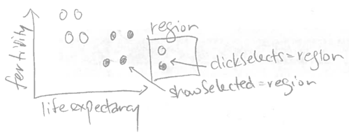
Since the legend has clickSelects=region, clicking an entry of that legend updates the region selection variable. Note that animint automatically makes every discrete legend interactive, so you do not need to explicitly specify clickSelects=region for the legend. In fact, when we specified color=region for the geom_point, animint2 does two things automatically:
showSelected=regionis assigned to the samegeom_point.clickSelects=regionis assigned to the color legend.
Note that clickSelects keywords are not limited to interactive legends. Each geom has its own clickSelects variable, which determines which selection variable is updated after clicking that geom. In the next section we will give several examples of how clickSelects can be used in combination with showSelected to create interactive data visualizations.
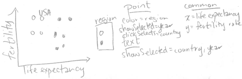
Use clickSelects to identify points on a scatterplot
The goal of this section is to create the following visualization of the World Bank data.
To start, consider the following R code which generates a scatterplot of the World Bank data:
library(animint2)
data(WorldBank)
scatter <- ggplot()+
  geom_point(aes(
    x=life.expectancy, y=fertility.rate, color=region,
    key=country),
    showSelected="year",
    clickSelects="country",
    data=WorldBank)
scatter
## Warning: Removed 1490 rows containing missing values (geom_point).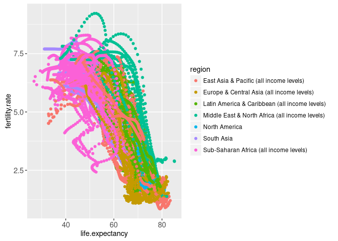
Note that the plot above is not interactive, because it is rendered using the traditional R graphics device. In contrast, rendering the same ggplot using animint2 results in the following interactive plot:
(viz.scatter <- animint(
  scatter=scatter,
  duration=list(year=2000)))
Try clicking data points in the scatterplot above. You should see the value of the country selection menu change after clicking a data point. You should also see that the data point for the selected country is darker than the others. This serves to highlight the current selection, and is performed automatically for each geom with clickSelects. By default the selected point has alpha=1 (fully opaque, no transparency), and the other points have alpha=0.5 (semi-transparent). These defaults can be customized; for example in the code below a black outline is used to highlight the current selection.
animint(
  ggplot()+
    geom_point(aes(
      x=life.expectancy, y=fertility.rate, fill=region,
      key=country),
      shape=21,
      color="black",
      color_off=NA,
      showSelected="year",
      clickSelects="country",
      data=WorldBank))
The data visualization above shows the currently selected country name in the selection menu, but it would be better to show it as a text label on the scatterplot. We can do that by adding a geom_text layer with two showSelected variables:
viz.text <- viz.scatter
viz.text$scatter <- scatter+
  geom_text(aes(
    x=life.expectancy, y=fertility.rate, label=country,
    key=country),
    showSelected=c("year", "country"),
    data=WorldBank)
viz.text
After clicking a data point in the scatterplot above, you should see a text label with the country name appear. Furthermore, try changing the year using the selection menu. You should see the text label move in a smooth transition along with the corresponding data point.
The data visualization above contains more than one geom, each with different interactive features. Try clicking the “Start Tour” button at the bottom of the data visualization, which will show what interactive features are available for the first geom in the data visualization. Clicking Next will show information for the next geom, and clicking Done or the grey background will end the Tour. The “Start Tour” feature can be useful for new users of your data visualization to discover what interactive features are present in each geom. The information displayed during the tour can be customized, by specifying the help and title params of each geom.
As explained in the last chapter, any variable specified using the showSelected argument of a geom is treated as an interactive variable. In the example above, we specified two showSelected variables for the geom_text. This means to only draw a text label for the rows of the WorldBank data set that match the current values of both selection variables. Since each combination of country and year has one row in these data, only one text label will be shown at a time.
Try clicking the legend entry that corresponds to the region for the currently selected country (e.g. if Canada is selected, try clicking the North America legend entry). You should see the point disappear, but the text stay displayed.
Exercise: how can you get the text to disappear along with the point? Hint: you need to add a keyword to the geom_text.
In the last chapter, we introduced the terms “direct manipulation” and “indirect manipulation” to describe interactions with legends and menus. In the data viz above, we can change the value of the country selection variable by either clicking a data point (direct manipulation) or using the selection menu (indirect manipulation). Both techniques are useful, but for different purposes:
- Direct manipulation by clicking data points is useful to find the names of countries with extreme values of fertility rate and life expectancy. For example, for the year 1960, clicking the point at the bottom left of the plot reveals the country name Gabon.
- Indirect manipulation using menus is useful to see the plotted position of a country of interest. For example, it would be difficult to find France by clicking all the different points, but it is simple to find France by typing its name in the selection menu.
Note that when the data viz above is first rendered, the selected country is Andorra and the selected year is 1960. Since the data for Andorra is missing in 1960, there is no text label drawn at first. To change the first selection, you can specify the first option, as explained in the next section.
The first option
To specify the selection that should be shown when the data viz is first rendered, use the first option. It should be a named list with entries for each selection variable. For example, the code below specifies 1970 as the first year, United States as the first country, and North America and South Asia as the first regions.
viz.first <- viz.text
viz.first$first <- list(
  year=1970,
  country="United States",
  region=c("North America", "South Asia"))
viz.first
Note that in the data viz above, there is only one country selected at a time. In the next section, we will explain how the selector.types option can be used to change country to a multiple selection variable.
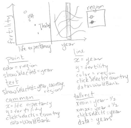
The selector.types option
In this section our goal is to produce a slightly more complicated version of the scatterplot in the last section. The sketch below has only one difference with respect to the sketch from the last section: text labels are shown for more than one country.
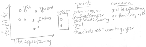
In animint, each selection variable has a type, either single or multiple. Single selection means that only one value can be selected at a time. Multiple selection means that any number of values can be selected at a time. In the plots in the last section, multiple selection was used for the region variable but not for the year and country variables. Why is that?
By default, animint assigns multiple selection to all variables that appear in interactive discrete legends, and single selection to other variables. However, single or multiple selection can be specified by using the selector.types option. In the R code below, we use the selector.types option to specify that country should be treated as a multiple selection variable.
viz.multiple <- viz.first
viz.multiple$selector.types <- list(country="multiple")
viz.multiple
When the data viz above is first rendered, it shows data points from the year 1970, for each country in North America and South Asia. It also shows a text label for the United States.
You may have noticed that it is easy to add countries to the current selection, by clicking data points. Normally, clicking a selected data point will remove that country from the current selection. However, in this particular data viz, it is not so easy to remove them, since the text labels are rendered on top of the data points.
Exercise: Re-make the data viz above so that clicking a text label removes that country from the selection set. Hint: you need to add a clickSelects keyword to the geom_text.
Note that in the data viz above, the year variable can only be changed via the selection menu.
In the next section, we will add a facet with a geom that can be directly clicked to change the year variable.
Selecting a year on a time series plot
The goal of this section is to add a time series plot that can be clicked to change the selected year.
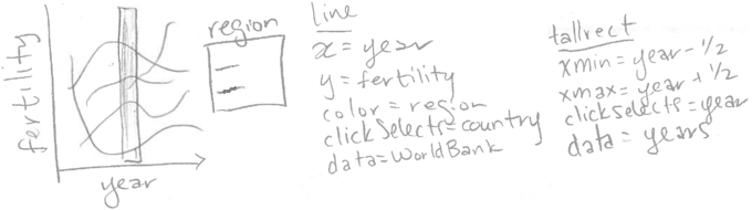
Note that the sketch above includes geom_tallrect, a new geom introduced in animint. It is “tall” because it occupies the entire vertical space of the plot, and thus only requires definition of its horizontal limits via the xmin and xmax aesthetics. Specifying clickSelects=year means that we want to be able to draw one tallrect for each year, and click a tallrect to change the selected year. Thus we need to create a new data set called years with one row for each unique year of the WorldBank data.
years <- data.frame(year=unique(WorldBank$year))
head(years)
## year
## 1 1960
## 2 1961
## 3 1962
## 4 1963
## 5 1964
## 6 1965Next, we add the time series ggplot to the existing data viz.
viz.timeSeries <- viz.multiple
viz.timeSeries$timeSeries <- ggplot()+
  geom_tallrect(aes(
    xmin=year-0.5, xmax=year+0.5),
    clickSelects="year",
    alpha=0.5,
    data=years)+
  geom_line(aes(
    x=year, y=fertility.rate, group=country, color=region),
    clickSelects="country",
    size=3,
    alpha=0.6,
    data=WorldBank)
viz.timeSeries
Try clicking the background of the time series in the data viz above. You should see the data points and text labels move in a smooth transition to their places at the newly selected year.
Animation exercise: make the data viz animated by specifying the time option, as explained in Chapter 3.
Multi-layer exercise: add a geom_text that shows the current year on the scatterplot. Add a geom_path that shows data for the previous 5 years.
Selecting a year on a time series facet
The goal of this section is to add a facet with a time series plot that can be clicked to change the selected year.
First, we re-create the scatterplot from the previous section using the addColumn then facet idiom, which is useful for creating ggplots with aligned axes.
add.x.var <- function(df, x.var){
  data.frame(df, x.var=factor(x.var, c("life expectancy", "year")))
}
scatterFacet <- ggplot()+
  geom_point(aes(
    x=life.expectancy, y=fertility.rate, color=region,
    key=country),
    showSelected="year",
    clickSelects="country",
    data=add.x.var(WorldBank, "life expectancy"))+
  geom_text(aes(
    x=life.expectancy, y=fertility.rate, label=country,
    key=country),
    clickSelects="country",
    showSelected=c("year", "country", "region"),
    data=add.x.var(WorldBank, "life expectancy"))+
  facet_grid(. ~ x.var, scales="free")+
  xlab("")+
  theme_bw()+
  theme(panel.margin=grid::unit(0, "lines"))
scatterFacet
## Warning: Removed 1490 rows containing missing values (geom_point).## Warning: Removed 1490 rows containing missing values (geom_text).
Note that the ggplot above uses the same aes definitions as the scatterplot from the previous section. The only difference is that we have used an augmented WorldBank data set with an additional x.var variable that we use with facet_grid. Below, we add geoms for a time series plot that is aligned on the fertility rate axis.
scatterTS <- scatterFacet+
  geom_tallrect(aes(
    xmin=year-0.5, xmax=year+0.5),
    clickSelects="year",
    alpha=0.5,
    data=add.x.var(years, "year"))+
  geom_line(aes(
    x=year, y=fertility.rate, group=country, color=region),
    clickSelects="country",
    size=3,
    alpha=0.6,
    data=add.x.var(WorldBank, "year"))
scatterTS
## Warning: Removed 1490 rows containing missing values (geom_point).## Warning: Removed 1490 rows containing missing values (geom_text).## Warning: Removed 759 rows containing missing values (geom_path).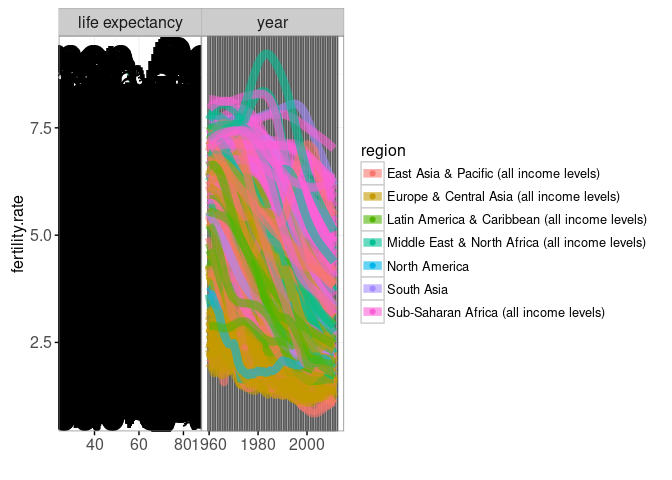
The two geoms defined above occupy a new facet for the "year" value of the x.var variable (defined by the add.x.var function). Since these two geoms have different definitions of clickSelects, clicking each geom will update the plot in a different way. Note that for the geom_line we specify size=3, which means a line stroke width of 3 pixels. In general it is a good idea to increase the size of geoms with clickSelects, to make them easier to click.
Also note that we specified alpha=0.5 for the geom_tallrect and alpha=0.6 for the geom_line. Since both of these geoms define clickSelects, some plotted lines and tallrect will be selected, and others will not be selected. The alpha values in R code specify the opacity of the selected objects, and other objects will have an alpha opacity which is 0.5 less than that value. In the example above, the un-selected lines will have alpha=0.1, and the un-selected tallrects will have alpha=0 (completely transparent).
As of September 2023, it is also possible to specify the opacity, fill, and color for objects which are not currently selected (alpha_off, fill_off, color_off). Users can specify these parameters in the geom (not aes) to freely create a different appearance for selected and un-selected items, instead of being forced to rely on the behavior described above. For more information, see the discussion and example in Chapter 6, section Specifying how selection state is displayed.
Finally, we use the R code below to render the new aligned scatterplot and time series using animint.
(viz.facets <- animint(scatterTS))
The interactive data viz above contains a new panel with lines that show a fertility rate time series over all years. Since we specified clickSelects=country for the geom_line, clicking a line updates the set of selected countries. Since we specified clickSelects=year for the geom_tallrect, clicking on a tallrect updates the selected year.
Exercise: add time, duration, first, and selector.types options to the data viz above.
Chapter summary and exercises
This chapter explained clickSelects, one of the two main keywords that animint introduces for interactive data visualization design. We used the World Bank data set to show how clickSelects can be used to specify different interactions for each of the plotted geoms. We explained how the first option can be used to specify the selected values that are used when the animint is first rendered. We also explained how the selector.types option can be used to specify multiple selection variables.
Exercises:
- So far we have seen three different ways to change selection variables: (1) interactive legends, (2) selection menus, and (3) clicking data with
clickSelects. Order these three techniques in terms from most to least direct manipulation. Which technique is preferable in what circumstances? - When
geom_point(clickSelects=something, alpha=0.75)is rendered with the usual R graphics device, how much opacity/transparency is present for all data points? When animint2 renders the same geom, some points will be selected and others not. What is the opacity/transparency of selected points? What is the opacity/transparency of points which are not selected? - Add
aes(size=population)to the points in the World Bank scatterplot. Is the size legend interactive? Why? - Add a
geom_textto the World Bank scatterplot that shows the selected year. - Add a
geom_textto the World Bank time series to show the names of the selected countries. - Add a
geom_pathto the World Bank scatterplot to show data for the last 5 years. - Use the
timeoption to make an animated version ofviz.facets. - Use
helpandtitleparams for each geom inviz.facets, to make a Tour which is more informative about what is displayed in each geom.
Next, Chapter 5 explains several different methods for publishing and sharing animints on the web.
